Attempting culture change with a ui kit
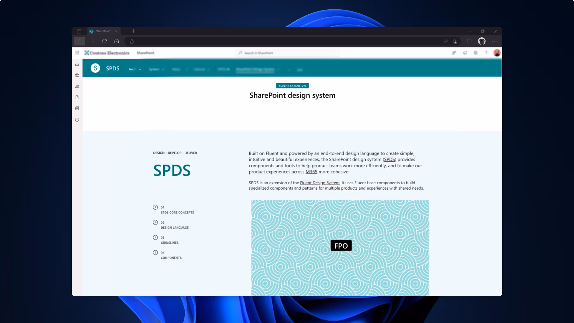
sharepoint design system
This case study paints broad strokes over my 5 years on the SharePoint design team, but it's highly concentrated on the last ~2+ years before moving to support the Teams design system team. Unless otherwise stated, all components shown throughout this case study have been redesigned and architected using Fluent 2 components, principles, and design system best practices. They represent what SharePoint's UI could be with proper systematic foundations, not necessarily what shipped during my tenure. To comply with my non-disclosure agreement, I have omitted and obfuscated confidential information.
I identified and articulated systemic design problems compounded over decades, building strategic cases that shifted organizational priorities from feature velocity to foundational investment. Adapted Fluent's design foundations to SharePoint's complex platform needs—translating type ramps and token libraries, building component documentation—while creating scalable processes for knowledge transfer and cross-functional collaboration that enabled continued team success.
A little back story
SharePoint has been Microsoft's collaboration backbone since 2001, serving over 200,000 organizations. By 2020, it had a reputation problem - it was notoriously complex, unintuitive, and frankly, people often hated using it.
Enter "modern SharePoint" - Microsoft's ground-up redesign that launched in 2017-2018, coinciding with the massive shift from on-premise servers to SharePoint Online in the cloud. This wasn't just a visual refresh. It was Microsoft's attempt to transform SharePoint from "that clunky document repository IT forced on us" into something people might actually want to use.
I joined as a contractor in 2018 right as this transformation was happening, hired to support Customer Success by driving modern SharePoint adoption through initiatives that included building demo sites, working with enterprise customers, and creating marketing deliverables. I was embedded with the SharePoint design team, attending the same crits and events as everyone else - but I wasn't a feature designer with a PM and engineering crew. My job was designing with the product, not designing the product.
This unique position meant I lived in SharePoint every single day, building real sites for real scenarios. And when you use a product constantly to solve actual problems, you can't help but see the cracks. Cracks that revealed bigger issues, especially at the system level.
I didn't set out to define a multi-year design system journey. But by 2020, with internal products depending on SharePoint as their foundation and the platform unable to provide basic design resources, the need became undeniable. What started as "we need a UI toolkit" became something much larger: changing how an organization thinks about design at scale.
This isn't a story about building components. It's about setting a team up for success in a way they never had been before.
problem
What I saw from my unique position
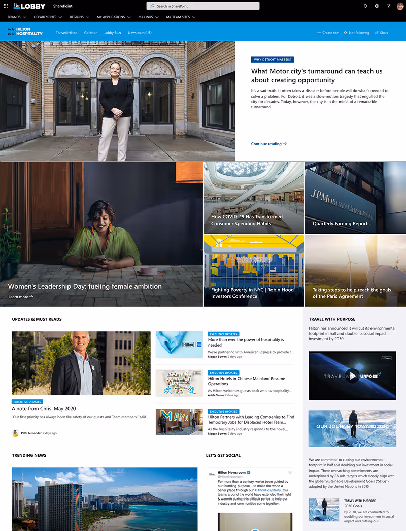
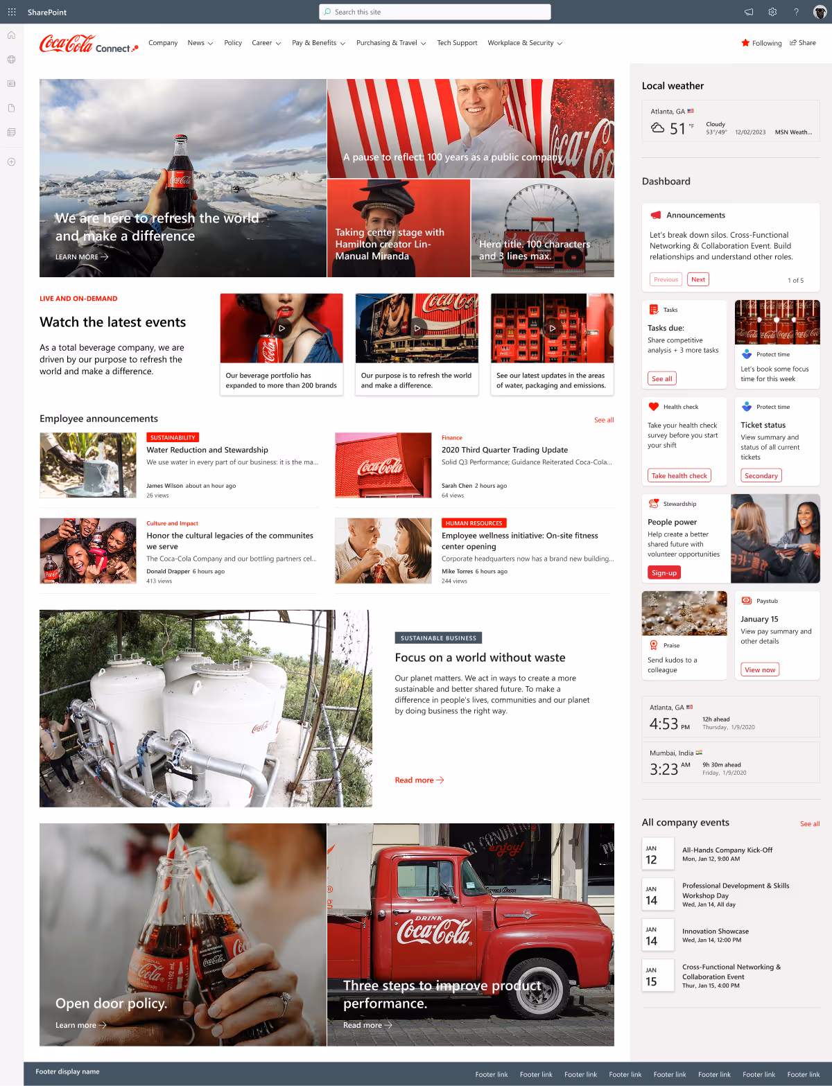
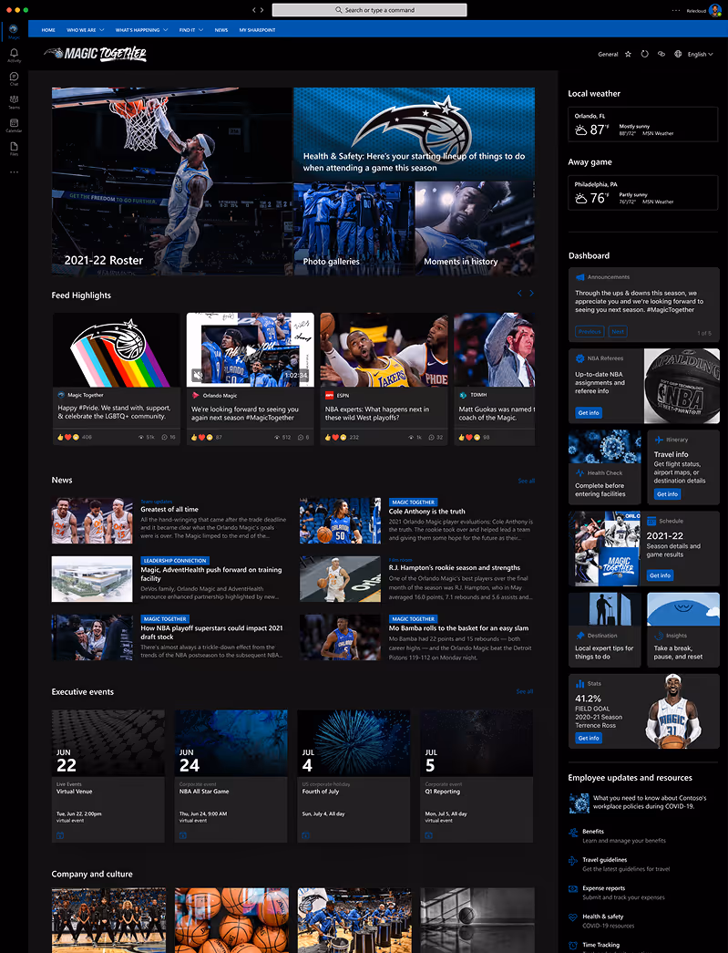
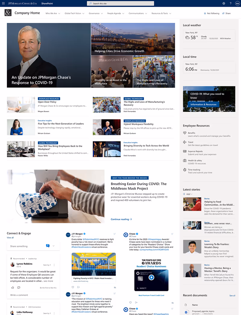
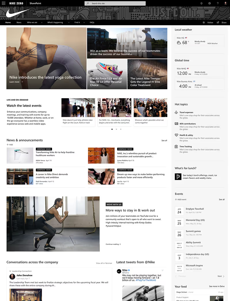
My Customer Success role meant using the product the way actual customers did - presenting "the art of the possible" to companies like Coca-Cola, Hilton, Nike, and JP Morgan Chase, then funneling their feedback back to the product team.
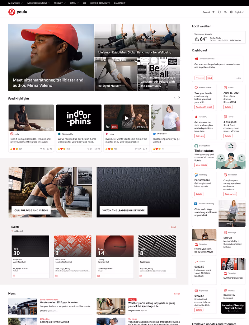
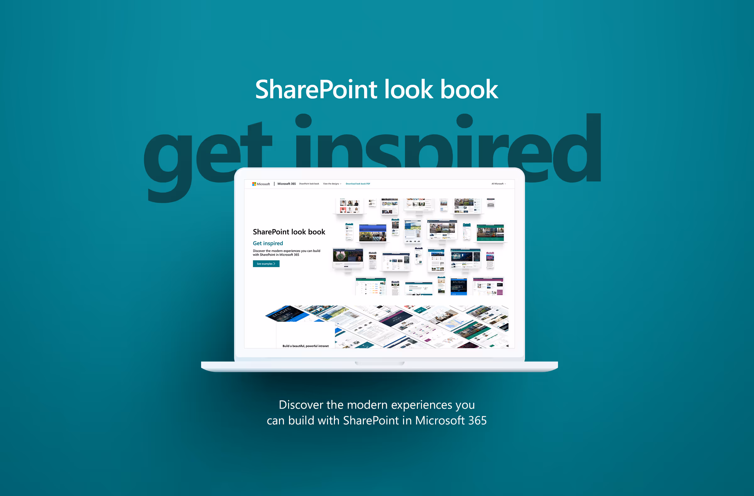
I created the SharePoint look book, built the entire demo tenant for demos.microsoft.com, and developed site templates that eventually made their way into the product itself. My early work influenced the team to bring templates into the product - a huge win considering they were the second most requested feature after custom fonts.
But I was also working with internal teams, creating product mockups and providing basic templates they could build from - sometimes refining or obfuscating content to comply with Microsoft's guidelines.
During my first three months, I built all the demo sites for that year's Ignite Conference. This was the year the new modern SharePoint was really going to be on display. My manager asked me to document any frustrations or improvements I'd recommend, so I presented my findings to the design team. The issues I found were significant.

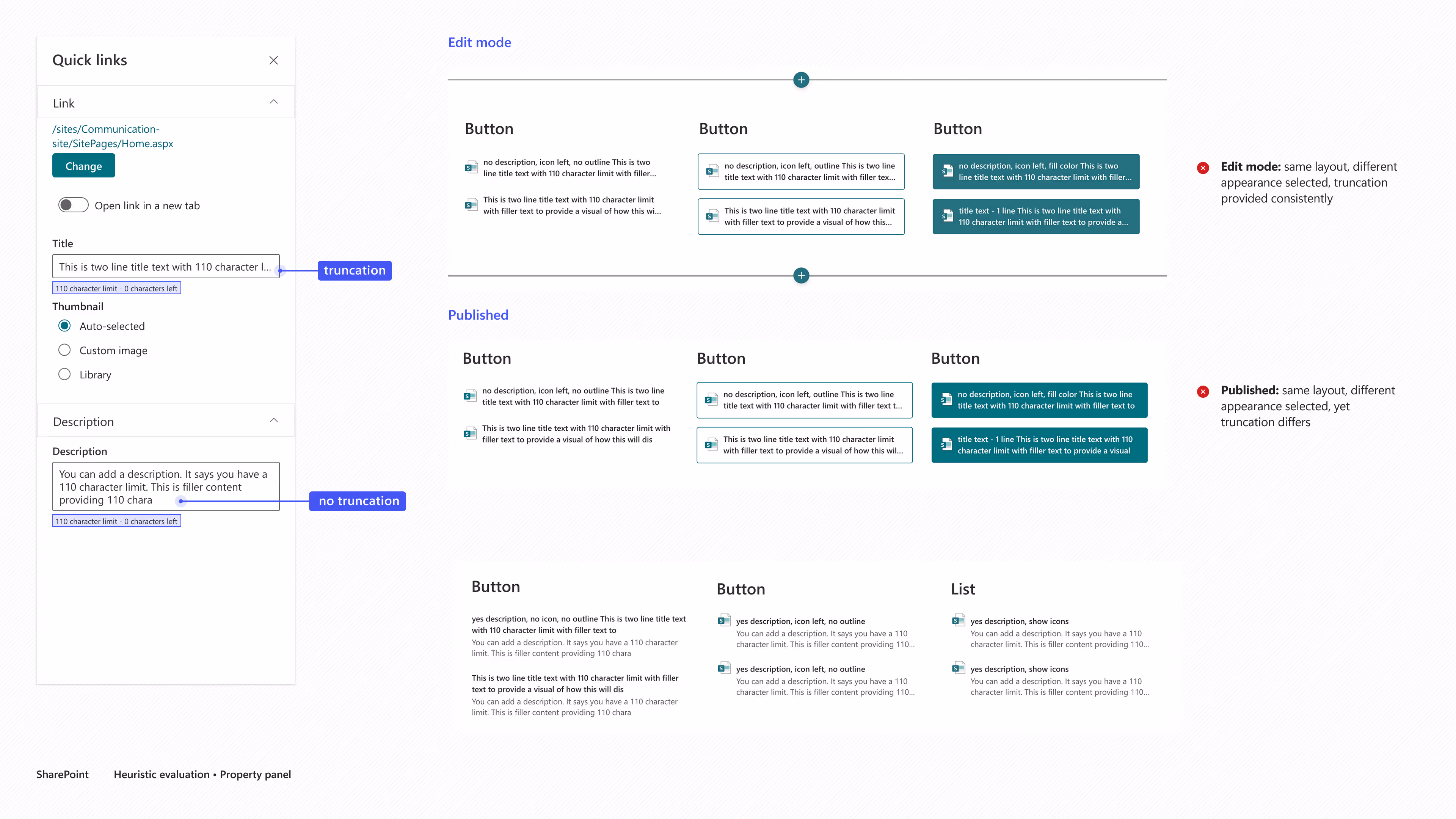
The editing experience was misleading
Web parts had rigid constraints with inconsistent property pane behavior
Configurations in edit mode didn't match the published output
Quick Links was the poster child: full text displayed while editing, truncated or broken once published

Basic interactions weren't resolved
Same functions used different controls (sliders vs toggles)
No clear confirmation on saves, leading to confusion and duplicated work
Performance issues lacked status indicators, users assumed the site was broken

Patterns weren't established
No clarity on when or why to use cards, shadows, or elevation values
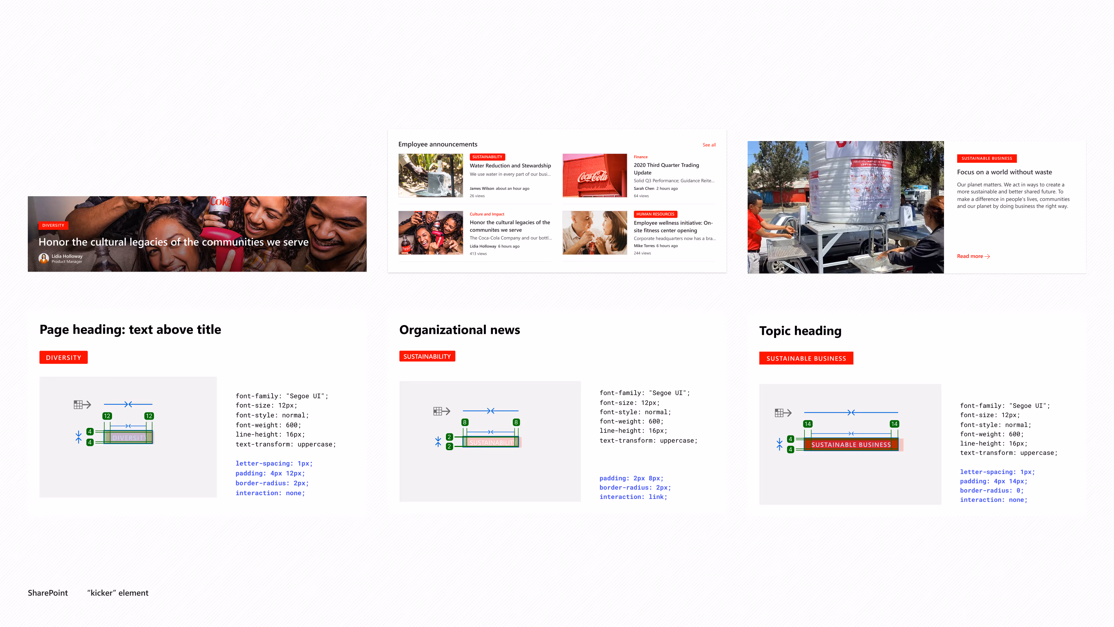
The "kicker" element appeared throughout the product with no consistent logic (sometimes clickable, sometimes decorative, always inconsistent styling)
Layout variations were inconsistent across similar components
I assumed these rather significant UX issues would get prioritized. They weren't. And unfortunately, that wouldn't be the only time critical fixes got backlogged in favor of shipping new features. But these surface-level problems were just the beginning. The deeper I dug into actually building with the product, the more I realized something fundamental was broken.
The systemic reality
Why is the color of the stitching in the seats important if you aren't going to bother fixing the flat tire?
The organization was more concerned with shipping features than addressing the fundamental issues underneath. At the outset, a lot of this was assumptions - tales and conversations I was having with other designers, things I saw on the peripheral. The feature factory mentality was evident in how my three-month audit findings got backlogged. But what I could see clearly, working in the product every day, were the symptoms of deeper issues.
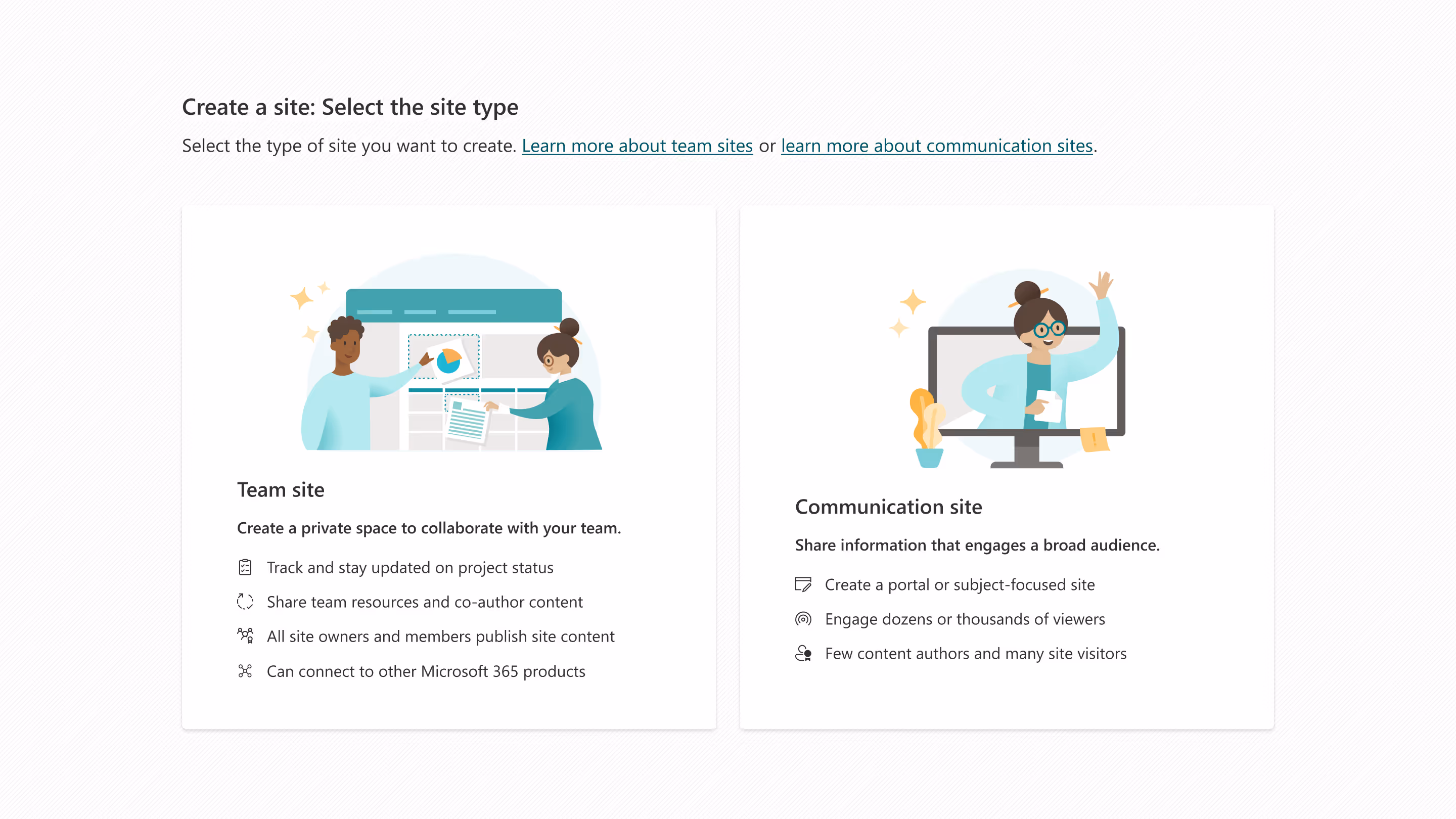
No shared foundations
Teams built components in isolation, creating variations across the experience. The confusion between Team sites and Communication sites wasn't just a naming problem - the page templates functioned differently, and users had to completely relearn page creation depending on which type they used. There's something to be said when you have to provide links to learning resources in a basic product flow.
No governance or patterns
There was no process for ensuring consistency or managing changes. No design system to establish when to use specific patterns or components. Just teams building features without shared guidelines.
No documentation
When I couldn't get grid specs, when patterns weren't defined, when component behavior was inconsistent - these weren't isolated gaps. They were evidence that foundational work wasn't being prioritized or resourced. I would invite
All of this pointed to a bigger concern: no ability to scale as a platform. SharePoint was infrastructure for Teams and needed to be the foundation for Viva, but we couldn't provide other product teams with basic design resources. Technical debt doesn't just accumulate when you prioritize new features over foundations - it multiplies. Every new feature built on broken foundations inherits that chaos and makes it harder to fix later.
The SharePoint jargon alone - Lists, Libraries, Web Parts, Site Collections - confused new users. This was a byproduct of lack of empathy for our users, assuming they understood terms that had been used since the onset of the product when IT and Engineering "built" a SharePoint tenant, rather than end-users who designed and used an internal company portal.
When one role closes, another role opens
By early 2020, my role in Customer Success was in a somewhat precarious position. So much of what I'd delivered had either been translated into fully supported programs (via Microsoft Learn) or had made its way directly into the product (page and site templates being the big win). I'd essentially solved my way out of my original role description.
During a conversation with my manager about priorities for the next six months, we discussed where I could add the most value. This turned out to be perfect timing—the new Viva Connections team needed support, and I was available.
Microsoft Viva was being developed as an Employee Experience Platform based on years of research into workplace connection, insight, purpose, growth, and empowerment. But when the pandemic forced organizations into remote work overnight in 2020, what was once a strategic initiative became an urgent necessity. The challenges Viva was designed to address—employee stress, disconnection, and the need for unified digital experiences—were suddenly amplified and immediate.
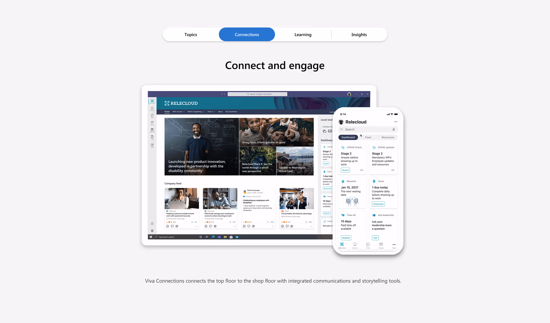
Viva Connections was positioned as the gateway to this employee experience, utilizing each tenant's home site on SharePoint as its foundation. A personalized hub bringing together news, conversations, resources, and tasks into a single destination. The new dashboard and feed components were being built as customized web parts, with the entire experience relying on SharePoint's platform. For this to work, the Viva team needed SharePoint to be reliable, consistent, and well-documented.
The moment everything clicked
After meeting with Viva's design leadership, where they presented the comprehensive UI toolkit they were building, they had a straightforward request: could SharePoint provide the same?
I reached out to the Sites and Pages design team asking for starter templates or component files I could share. I already knew they didn't have what I was asking for, but I needed this confirmed in writing - something concrete to validate the gap.
The response confirmed what I suspected: when designers onboarded to our team, they weren't set up for success. No UI kits, no component libraries, no tools. If project files existed in shared folders, they were often outdated or cobbled together from screenshots.
When I raised this as a concern, the Sites and Pages manager sort of shrugged it off as a non-issue.
But this wasn't just about missing Figma files.
Building the case
Getting my manager on board was the first critical step. As the partner design director overseeing SharePoint, she had the organizational clout to make this happen—but first, she needed to be convinced it was worth the investment.
The Viva team's request gave me the ammunition I needed. This wasn't just about internal team efficiency anymore. It was about SharePoint's ability to be a reliable platform that other product teams could build on. Without foundational design resources, we were failing to support not just our own team, but the growing ecosystem of products depending on us.
Once she saw the strategic implications, she became a champion for the work. But getting “the powers that be” to fully buy-in would require a different approach.
As enterprise priorities go, strategic initiatives that become urgent necessities quickly become top priorities. I swiftly transitioned to start building a prototype of Viva Connections. With the team heads down on the desktop sandbox build, my efforts focused primarily on building out the mobile prototype.
I convinced my manager to request additional budget to bring on a contractor who could start building out the UI kit while I focused on the prototype. I think what really sold her on the ask was me offering to hire and supervise the contractor myself.
Getting the contractor approved was the tactical win. But I saw this as more than a temporary fix. I positioned myself as SharePoint's very first product designer focused on design systems - a role that didn't exist before because the need hadn't been articulated clearly enough. The Viva dependency gave me the leverage to make that case.
The missing UI toolkit was just the entry point. The real opportunity was changing how SharePoint approached design at scale.
The foundations needed fixing. The patterns needed establishing. The team needed setting up for success.
process
Starting with what I could control
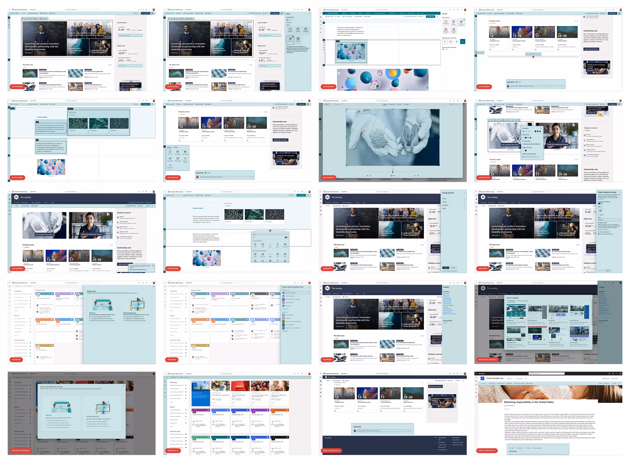
Getting the contractor approved to build the UI toolkit was my first tactical win. My mindset was of course on solving the bigger systemic issues, but I couldn't lead with that. The focus had to be getting the most out of having this amazing extra asset (highest of fives goes out to you Marc Bostian) to build out UI components that had never existed before.
I took on hiring and supervising the contractor myself. This allowed me to see firsthand what the process was from the other side of the hiring table - another invaluable learning experience in a role that kept expanding in unexpected ways. But more importantly, it gave me direct control over how we approached the work and what we prioritized.
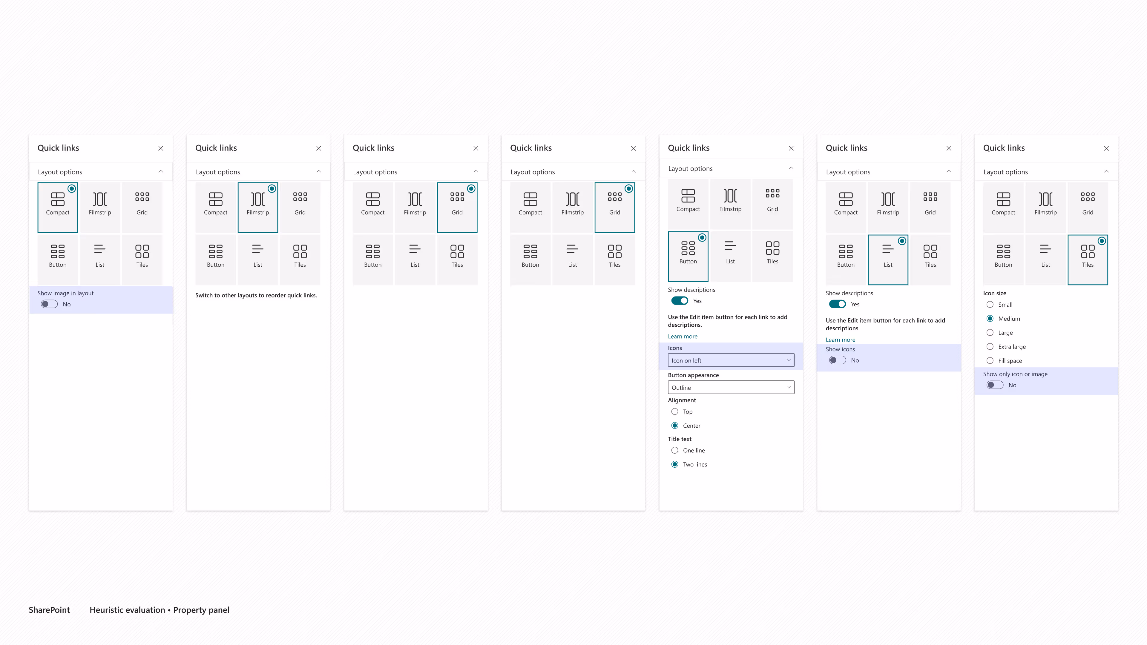
To be honest, there could be an entire case study around the tactics we took on what to prioritize and how to go about building components for so many use cases caused by the various page templates.
For instance, the "hero web part" had two primary layout options - grid or layers. Each of these had additional options for configuration, and depending what size the section is where you place said web part could change the rendered layout even further. Not to mention how it looked in a team site vs a communication site.
During a check-in with the Sites and Pages manager and my manager, the contractor and I walked them through all the various layouts that just the hero web part created. They looked like deer in headlights and thought we were making too much work out of it. They didn't realize that we were breaking down every use case that was never really accounted for to begin with - having to do all the tedious extra work because it was never done before.
This was the moment I realized how deep the gap was. Leadership thought we were overthinking it. We were actually documenting what had always existed but had never been systematically addressed.
Working the angles
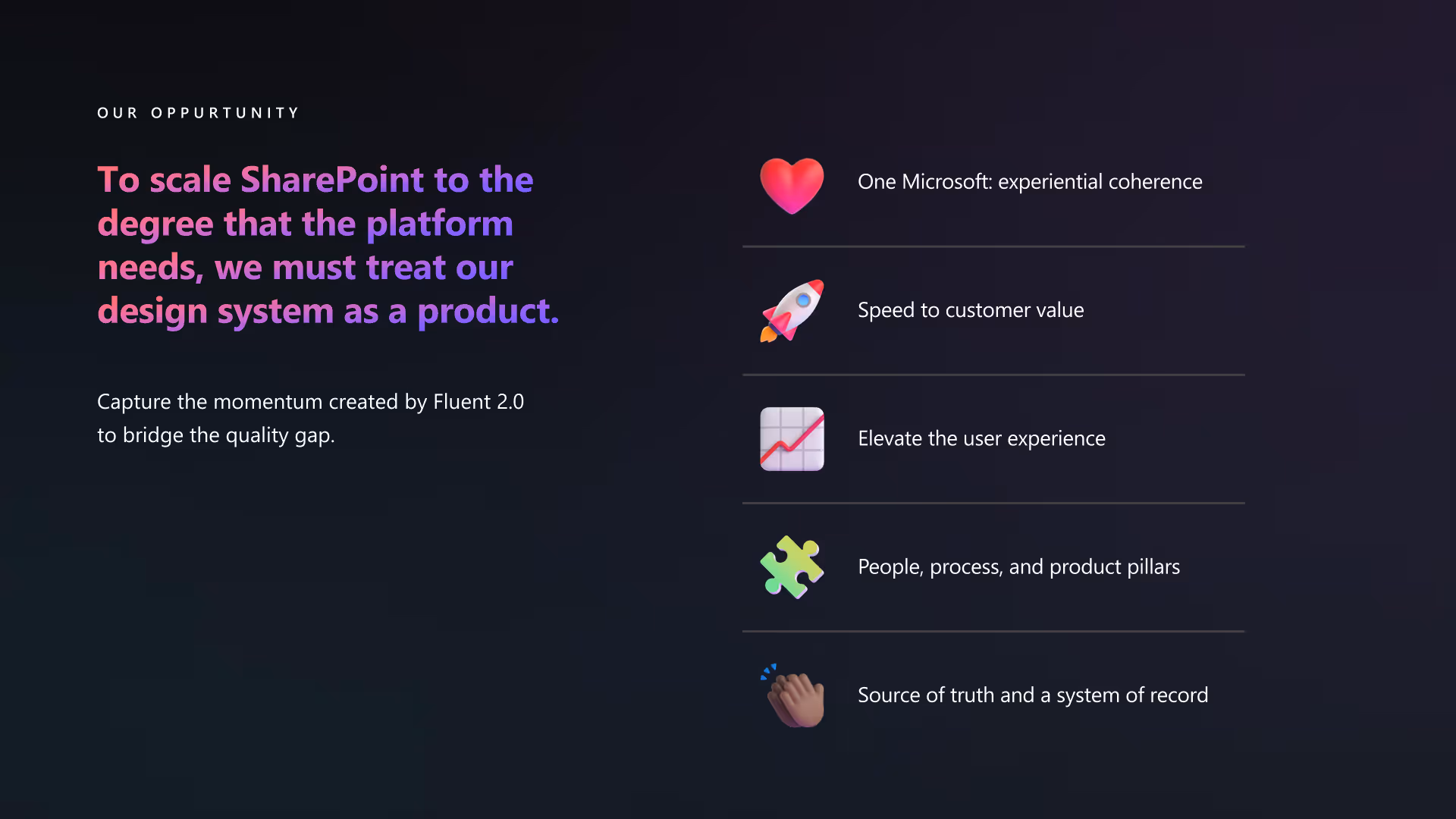
Getting leadership buy-in would take the better part of a year. My manager did the heavy lifting with executives, strategically positioning design system investment within already-planned product goals. We were hitching ourselves to ongoing initiatives focused on advancing SharePoint's design capabilities - finding ways to show how this work would supplement features already being developed while also helping build and ship new features, iterations, and products much faster and more efficiently.
She was smart about framing SharePoint as a platform, not just a product - especially considering the Viva team's reliance on our foundations. We had an opportunity to align with the Fluent 2.0 evolution while solving our own foundational problems. A platform refresh built on design systems would increase speed to customer value through shared code and streamlined feature development.
The narrative would have to be compelling - we needed the message to be about velocity, although I also knew it would also be about fixing what was broken.
But while she was working on leadership and product buy-in, we also knew we had to solve for educating folks on design systems at all levels across the org. I suggested we take on a training technique I'd utilized while working with partners in my Customer Success role - "tell, show, tell" - geared around education and evangelism.
Tell them what they're about to see. This would be a dual effort. My manager would make her rounds getting buy-in through telling how the design system would provide velocity and supplement planned features. I would make my rounds with my walking deck, presenting the vision, the rationale, and all the benefits a design system team could bring to their day-to-day work. I wrote a white paper covering the specifics of what a design system actually is - not just a UI toolkit, but a comprehensive approach to building consistently and efficiently. Plant the seeds.
Show them what it can do in action. Knowing that Vision Day was on the horizon, I mentioned that could be an ideal time to show some initial concepts of a Fluent 2.0 SharePoint. My manager quickly piggy-backed that with the work the Sites and Pages team was already doing envisioning what advancing SharePoint's design capabilities could be. I started creating mocks showing what the product could look like with Fluent components and an updated UI. The goal was for the show to be all jazz hands and wows.
Tell them again to reinforce the value. I put together an editorial calendar that included news posts, Teams announcements, and presentations where I could invite folks from the Fluent core team to speak. The goal wasn't just to get everyone excited (though that would've been nice). The goal was awareness. Water the garden.
This is where we were able to weave in the momentum created by Fluent 2.0. Microsoft was making a significant investment in evolving its design language and aligning the portfolio of products. This included the new Fluent UI React, which represented a major shift to design tokens and a more systematic approach to building UI.
We all knew SharePoint was behind, but not exactly how behind it really was.
Teams had spent the better half of the last year moving over to Fluent 2.0, refining both their front and backend. Viva was starting fresh with the latest tech stack. SharePoint was still running on outdated foundations while the rest of the M365 portfolio had already made major advancements.
But then..
mic drop


My manager shared with me that the "show" wasn't going to be a Sites and Pages level presentation. It was going to be presented and shared as a product-level initiative during Vision Day 2023. Senior leadership framed it as the first major design investment since 2015. The narrative they presented hit every point we'd been making:

We weren't anticipating this moment - we'd hoped for support, but this was leadership publicly committing to the work at an all-hands level. Seeing it announced this way gave the entire effort legitimacy.
What was "this is something that we need", now was "this is a strategic priority from the top".
solution
It takes a team
In less than six months, the team grew from just me - SharePoint's very first design system designer - to include two additional FTE product designers and a manager. I was involved during their entire hiring process and onboarding/training. If you're curious – yes – being part of the hiring process for my manager was, interersting. We also received part-time support from a PM and one FTE front-end engineer, both already in the org.
Understanding what we actually had
Before we could build anything new, we had to document what already existed. Because we couldn't rely on what we were able to locate in Figma to be correct or up-to-date - aside from the UI kit already in progress - we needed to document what actually existed, not what we wished existed.
We were able to utilize the tracking I had already started for the UI kit, but we got even more granular. The more we dug, the more use cases presented themselves, accounting for not just the different page templates, layout options, web part configurations, edit vs published mode, but also down to where it showed up in the product. The latter's distinction proved difficult.
From engineering and the product team's viewpoint, there wasn't a difference between the "product surface" (the SharePoint product chrome used to create, craft, and navigate) and "canvas surface" (the user's generated content area). When the end user applied a theme to their site, it affected both the product chrome and their site's content. Imagine using PowerPoint and changing your presentation's theme and the application's ribbon where said theme was chosen, updated to match your selection and didn't remain the PowerPoint red-ish orange.
The tracking was tedious work, but necessary. It provided us with a checklist to ensure all areas of the UI were being accounted for as well as providing a deliverable that could be prioritized.
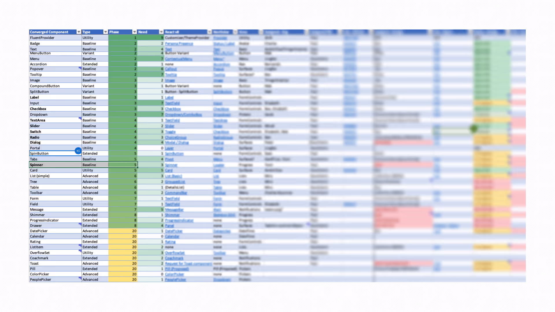
This tracking quickly became what I lovingly referred to as the BUS (big ugly spreadsheet), organizing work into P0, P1, and P2 priorities. The running joke became about how the most important things always ended up in the back of the bus.
Strategic prioritization within constraints
Everyday digital interfaces include a rich variety of images, visualizations, and other pictures. However, more than anything else, they are made of words. Way back in 2006 Oliver Reichenstein wrote an amazing article that synthesized that 95% of the information on the web is written language. And when it comes to internal company sites, that cannot be more true.
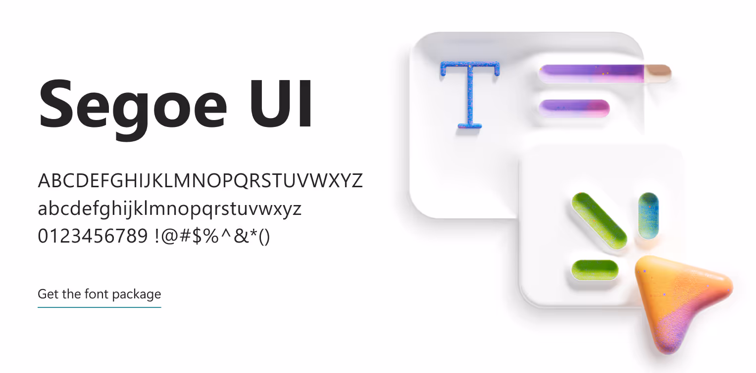
From a brand perspective, fonts are your company's words, its personality, and a reflection influencing consumer sentiment. SharePoint needs to be the vehicle that provides your company's message, and has only ever done that through Microsoft's brand font Segoe. Part of the initiative to modernize and advance SharePoint's design capabilities included tackling the number one customer wish list item and allowing the usage of custom fonts.
From a design system perspective, we were provided a perfect entry point. Not only could we partner on delivering something customers desperately wanted, but we could prove the value of design system thinking in the process. We assumed because this was foundational work that needed to be done, it made the most sense to also take on the feature work that coincided with delivering the new capability to customers.
Side note: You'd think a behemoth like Microsoft running a web-based product could enable custom fonts. Browser support for @font-face had been around for well over 10 years at this point. Little did I know what I'd uncover when I looked under the hood.
Looking under the hood
The custom fonts work required understanding our existing typography system - if we were going to map fonts to the UI, we needed to know what we were mapping to. Since we were starting from ground zero, I figured I'd do a quick audit hoping to orientate myself in the code.
But I had my suspicions things weren't going to be tidy.
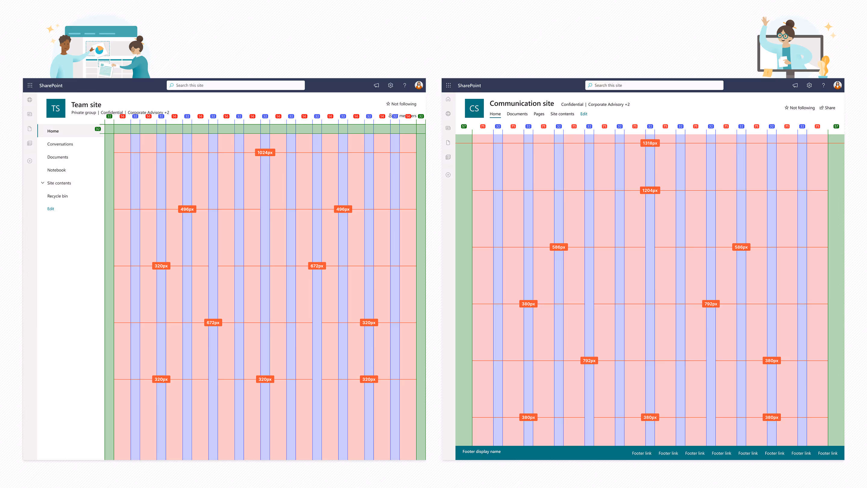
For months, I'd been unable to get anyone to provide actual grid specifications. SharePoint wasn't using a single page template - there were communication sites, team sites, home sites, news pages, and more, each set up differently. When I finally dug into the code myself to understand what was actually being used, I discovered why no one could give me a straight answer: the "documented" 12-column grid and what the CSS values actually delivered were completely different.
The lack of proper grid and spacing caused constant alignment issues. The type ramp wasn't built on a 4px grid, so text rendered all over the baseline. When your most basic building blocks - grid, spacing, typography - are inconsistent, everything built on top inherits that chaos.
So when the custom fonts opportunity came up, I knew I needed to see the full picture. I chose to analyze the semantic hierarchy structure and examine the CSS in detail.
What I found confirmed my suspicions - and was somehow even worse than I'd expected.
I shared my early findings with my Manager during my next 1:1. Things escalated quickly when he asked me to present the following day in the bi-weekly managers meeting with PM, Engineering, and Design.
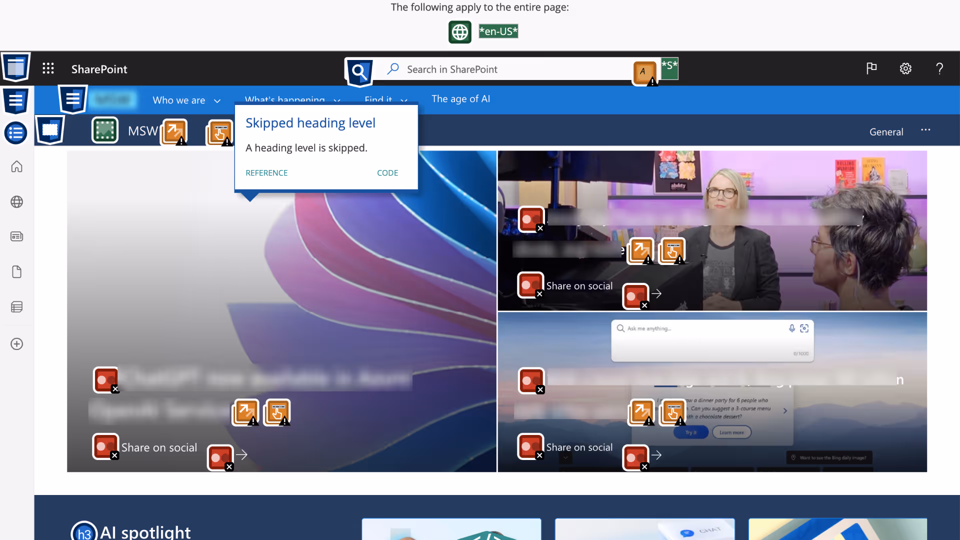
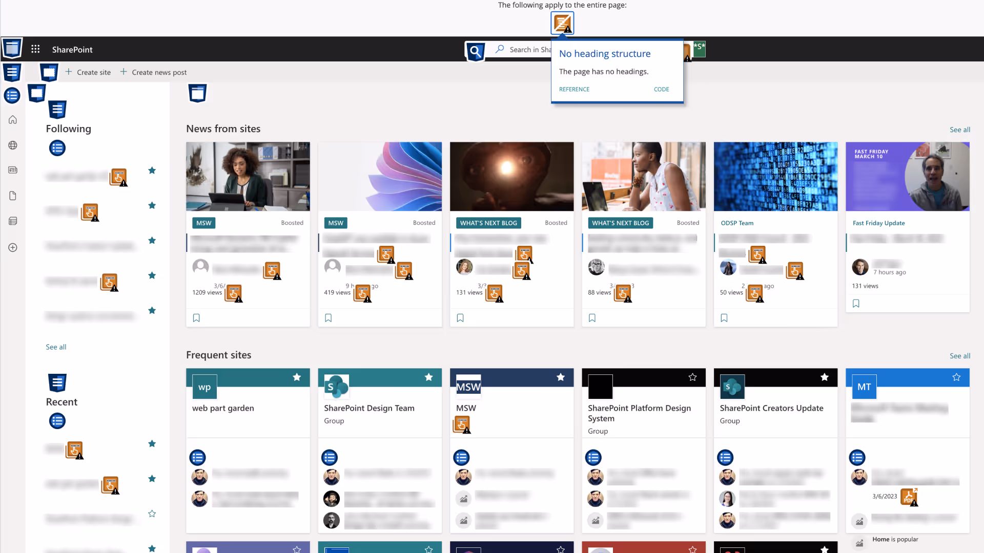
The semantic hierarchy was broken
Pages consistently had no topmost header, skipped heading levels entirely, and almost every web part title had zero semantic hierarchy. We weren't just inconsistent - we were failing WCAG success criteria.
The CSS was chaos
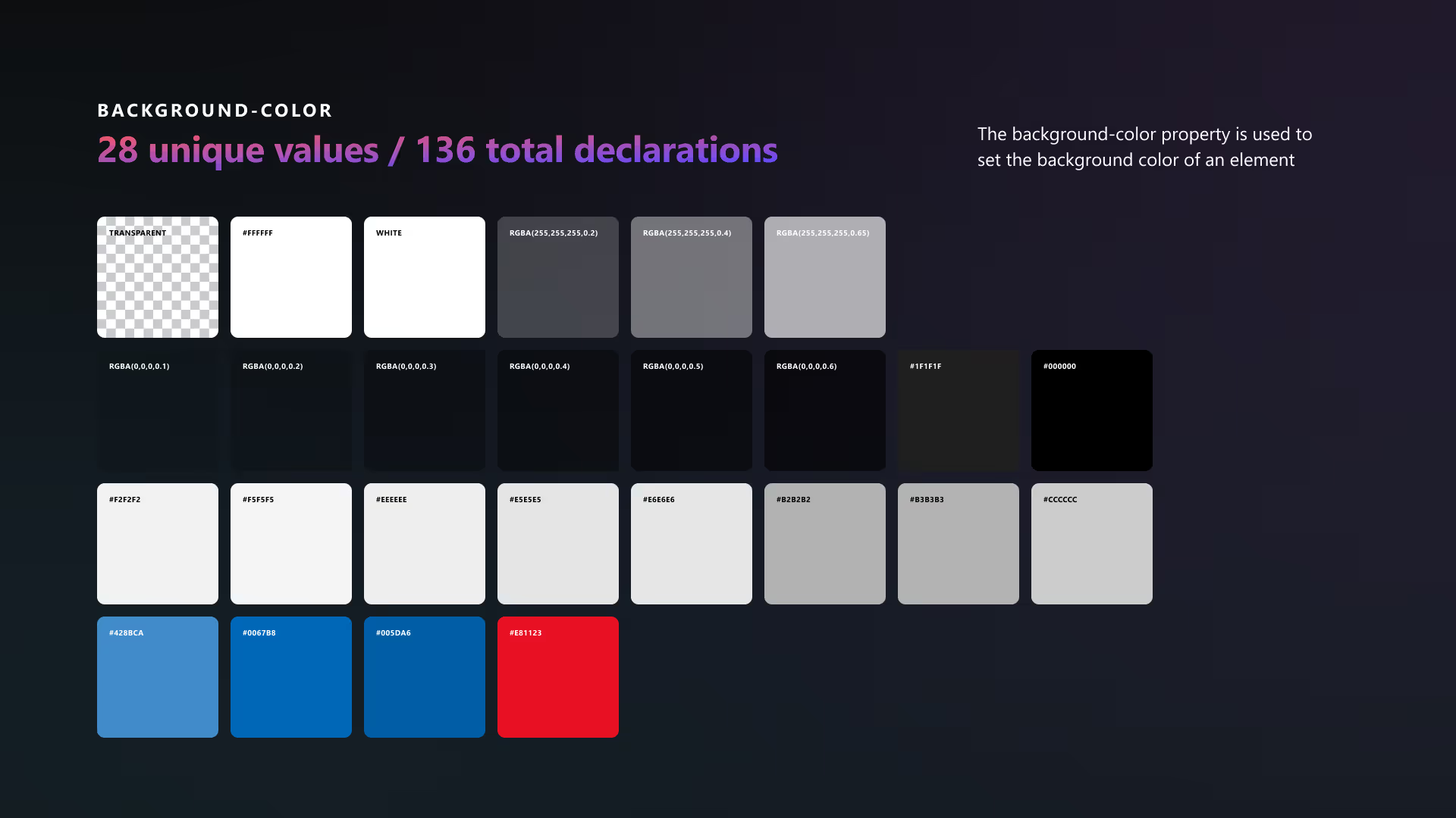
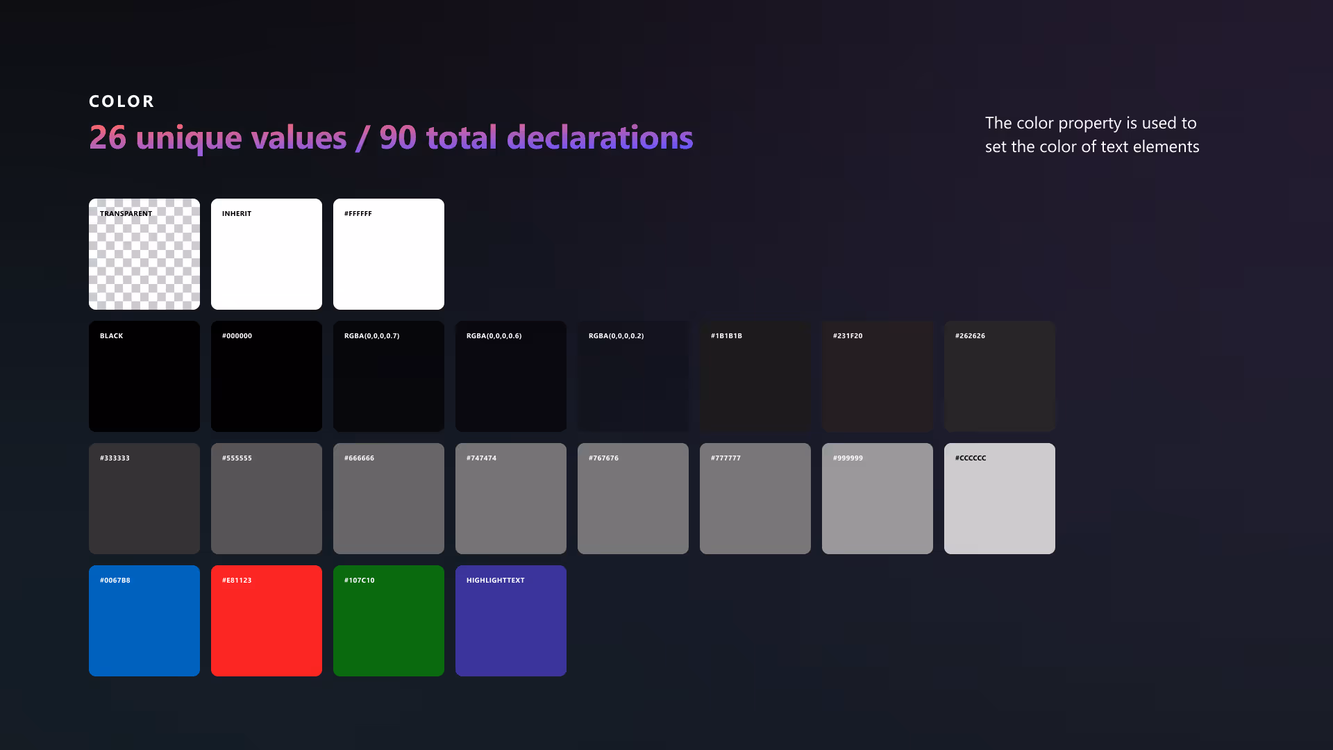
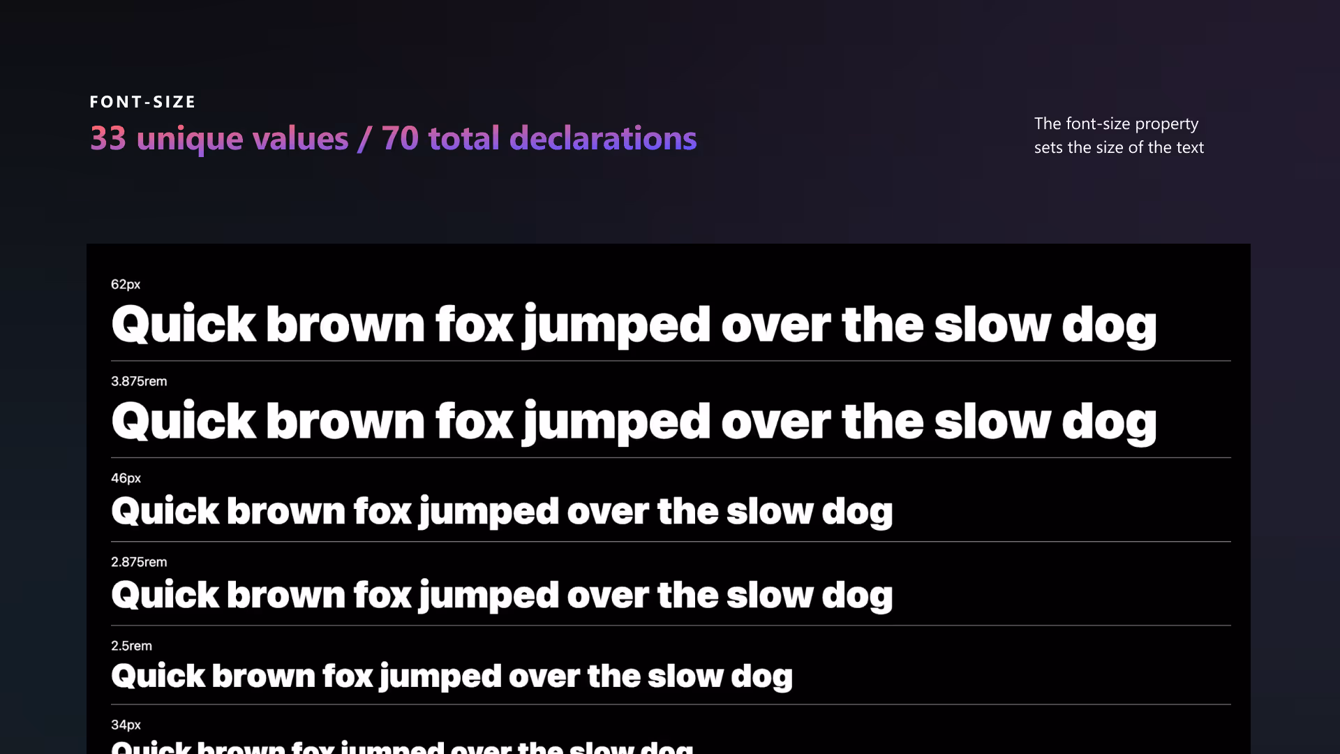
There were 1,819 class stylings plus 385 pseudo classes. Font sizes alone had 33 unique values across 70 declarations, including gems like 62px, 3.875rem, 48pt, 1em, and 75%.
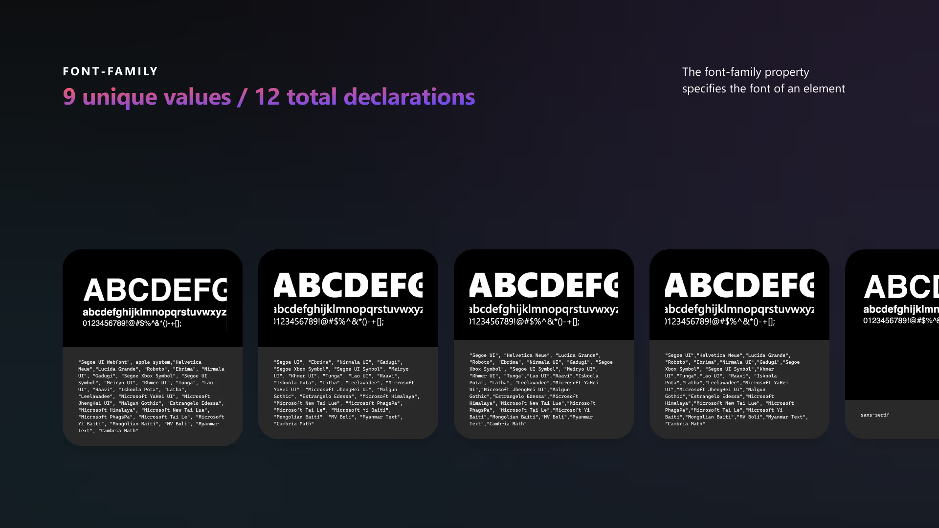
We had 28 unique background colors, 26 unique text colors, and 9 different font families. Classes were being written as one-off solutions that didn't scale.
I concluded with the comparison between the current state vs a token adoption state and cringed when I tried to lighten the mood when Marie Kondo took over the full screen stating what I thought was obvious.
Font size
70 total declarations vs 10 declarations
Line height
59 total declarations vs 10 declarations
Font weight
38 total declarations vs 4 declarations

The reactions were immediate. Engineering went into "let's fix this" mode - they knew it was bad but seeing the numbers made it undeniable. The PM looked like a deer in headlights, concerned about how this would impact feature timelines. Design leadership was thrilled - finally, objective data to make the case.
This audit happened after we'd secured buy-in for the design system team, but engineering had been pushing for a quick fix rather than full Fluent v9 migration. The data made it clear: bandaids wouldn't solve this. We needed to rebuild the engine, not just change the oil.
Navigating murky waters
Having only one assigned part-time front-end engineer, most of her time was spent diving into scoping repo build out and alignment with our other dependencies. Simultaneously, an engineering team in Shizou was scoping what it would take to adopt Fluent React v9.
As we prioritized web parts and updates to align with in-flight work, scope creep started popping up. Not all web parts had empty states, and when one of these web parts are used in a page, they don't show up in a published state. This gap limited what could appear in page templates with pre-populated structure.
Roles and responsibilities remained clear as mud.
I wrongly assumed my manager was (as he liked to put it) "storming and forming" the Fluent v9 roll out. Would feature designers spec all the web parts, or would SPDS handle it as we'd initially planned? We were the ones doing the audits, templates, tokens, and theming work, after all. From an engineering perspective, if we had to rely on feature crews to implement updates, how could we ensure this was prioritized on their backlog. The more we did the more we stood still not knowing the next move.
Little did I know a larger issue was to be uncovered. As our team was working on scoping the feature work for custom fonts, the PM defined the problem and vision but failed to provide functional specs detailing required features, user scenarios, and functional behaviors. The expectation was that we would receive some kind of Feature Specification, Product Requirements Document (PRD), or Design Brief. I would soon find out that the SharePoint PM org never provided this.

insert head shake -- what!?
When I requested this from the PM we were partnering with on custom fonts, all I got was the PowerPoint presentation she used when defining the problem and vision. I was missing the functional specifications covering the granular "what" and "how" that design and engineering teams NEED to build said feature.
When I tried to explain the request further, she just ended up continuously ghosting me. The situation deteriorated when my manager failed to support me through this roadblock.
These organizational challenges weren't just frustrating - they were symptomatic of the larger systemic issues we were trying to solve.
How do you establish new ways of working when the existing processes are broken and people resist change?
Delivering foundations
Knowledge transfer and capability buildings
SharePoint isn't well documented or intuitive - we've established that. Now imagine being a brand new designer, having little to no documentation to understand its complexities, and being tasked with updating the current UI so that it could handle complex platform updates such as design tokens.
Because of this, part of my time and priorities centered on training, onboarding, and teaching everything I could to help my teammates succeed. The product's complexity created a steep learning curve for new designers, and the design system work required a deep understanding of both SharePoint's current state and where we needed to go. Having been on the SharePoint team for almost 5 years I had collected a lot of knowledge and created repos with tutorials, walkthroughs, and other various helpful resources.
Fluent ambassador
From the onset of moving from Fluent v1 to v2, I participated as SharePoint's Fluent ambassador. Often this just meant attending meetings to stay up-to-date on the process and funneling details back during our design crits.
I was very much abreast of the state of all things Fluent 2.0, which I was able to funnel into my day-to-day work and by extension those I was training and onboarding. For a more detailed look at my various contributions and deliverables as a Fluent ambassador, see my One Microsoft case study.
Process and infrastructure
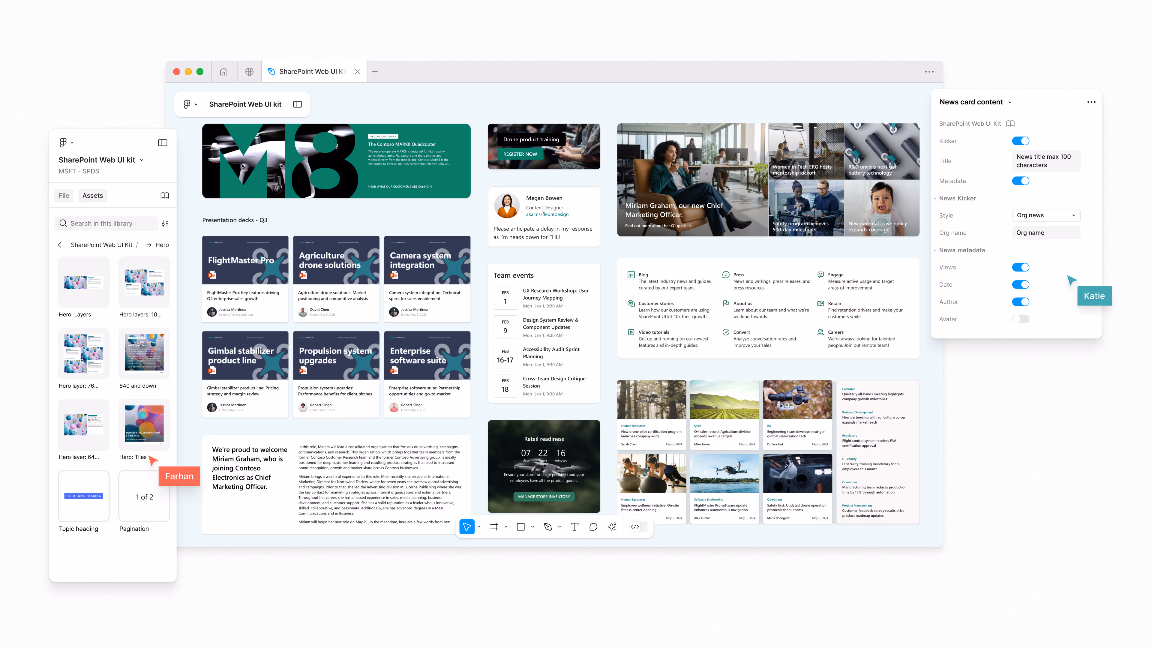
I set up and standardized Design System office hours to support both internal and external partner teams. As the assigned Figma admin for the SharePoint design team, I consolidated files, provided guidance on file structure and archival methods, and built a new thumbnail library that streamlined project file presentation.
I also designed and built the SPDS internal SharePoint site, including page templates, news posts, and a weekly newsletter - practicing what we preached about using the platform effectively. Although having an extensive background in site building from my days supporting Custom Success, my manager felt it was lacking and assigned the tasked to another team member. During this debrief the areas he called out as "lacking" where product specific or items he assumed that could be done but SharePoint could not do. Case in point, refer back to "Knowledge transfer and capability buildings" above.
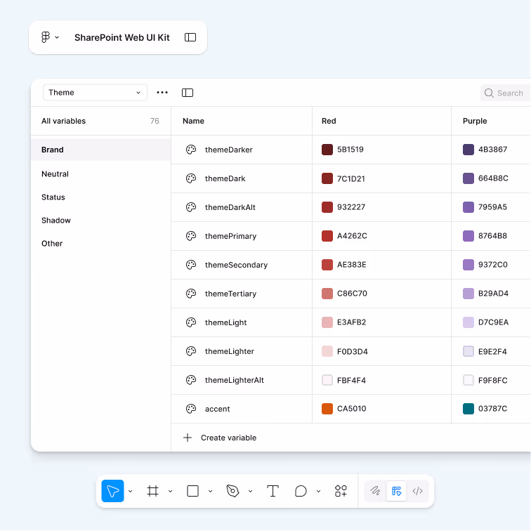
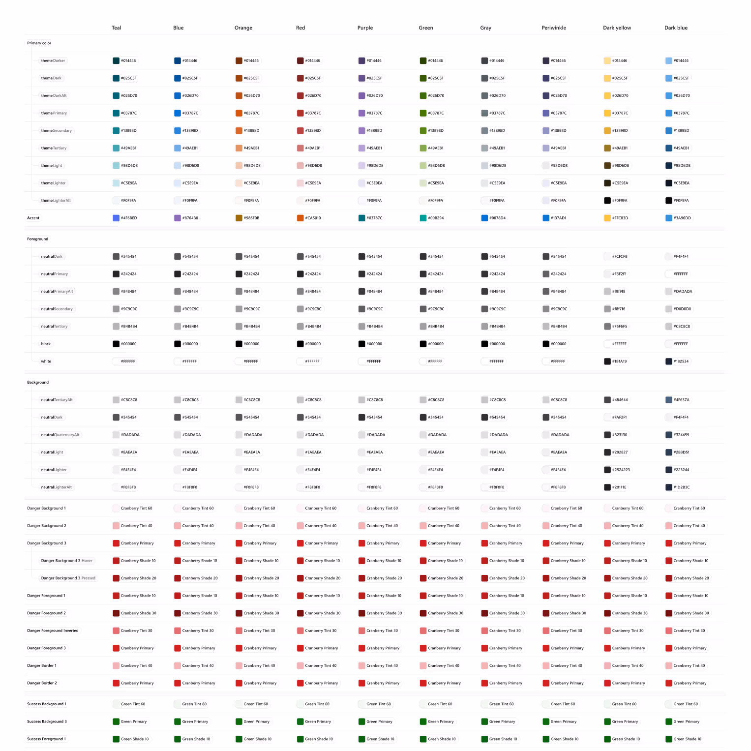
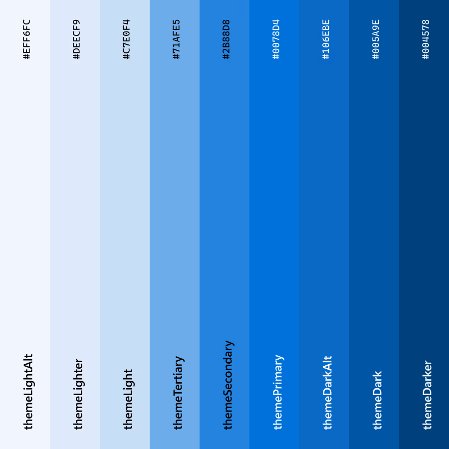
SharePoint Web variable library
The semantics of token adoption
The core Fluent team set up both a primitive and semantic Figma library and was doing a proper job reaching out while also being available to product teams to help answer questions as we all went heads down on token adoption (aka refactoring our ui kits). The assumption across teams was that everyone would utilize their library which would in turn remain in sync with the Fluent code base.
That would be too easy.
SharePoint's theming was based on two kinds of theme slots: Fabric palette slots and semantic slots. While I could dive super deep into the complexities of what that meant for token adoption, I'll just fast-forward to some of the initial quick wins we hoped to provide while the multi-year process to detangle worked in the background. When you are asked to put up scaffolding around a shaky foundation, you often find yourself working through some very complex situations.
I translated and delivered a core library that supported all 13 out-of-the-box color themes' semantic values into variables - an especially complex undertaking because each theme had to support four theming modes (none, neutral, soft, strong) across nine semantic slot values. We'd be living between semantic slots and tokens for a while, so the library needed to bridge both worlds.

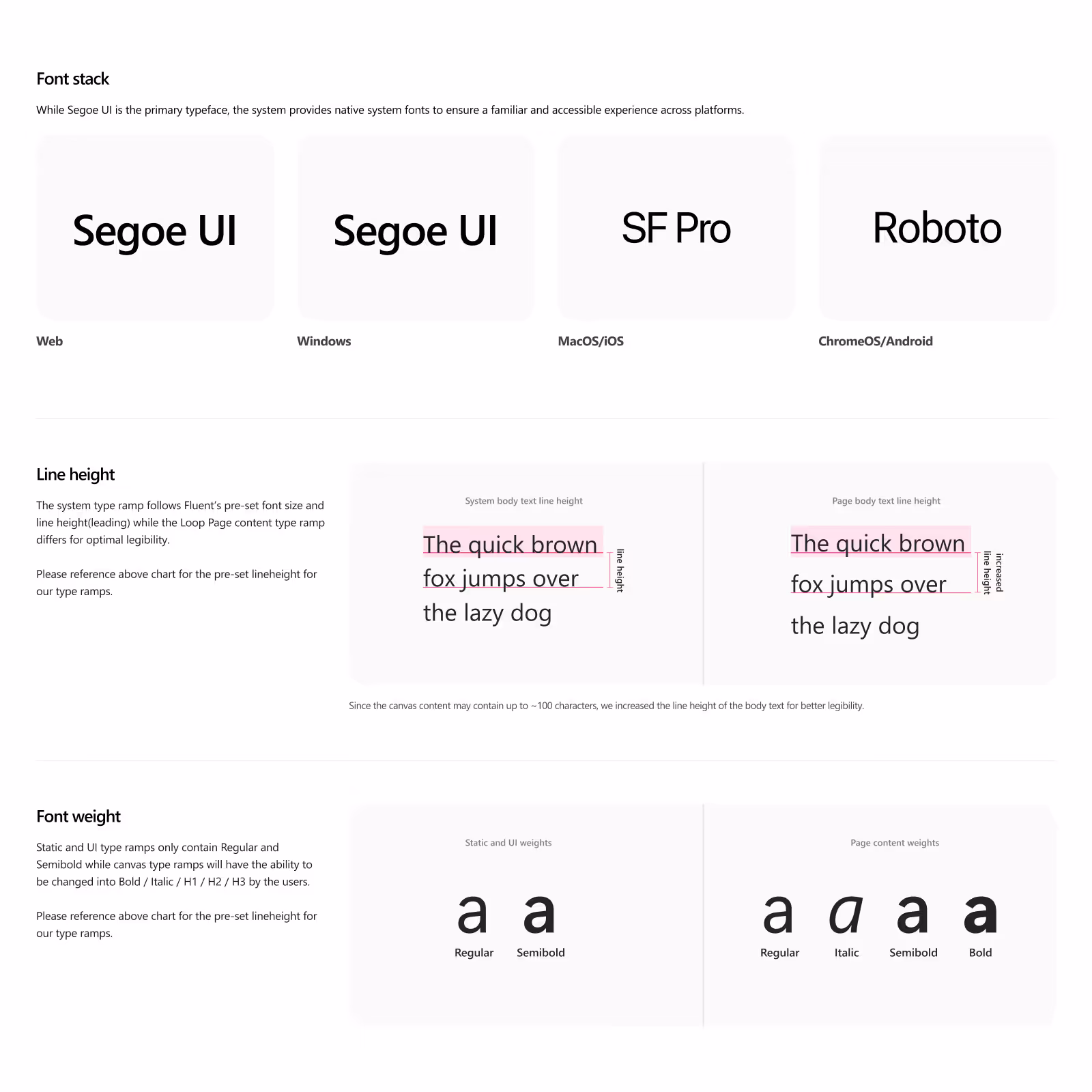
Web design is 95% typography
After an extensive type audit collecting CSS values of UI elements across a production environment, I had tangible evidence I could use to create a backlog of bugs to bring our UI into alignment with Fluent's established type ramp. I worked with product owners when large gaps provided disparity and finalized resolutions into a backlog with roughly 250 bugs.
This allowed transitioning over to creating and building out a slightly customized token repo to support the immediate P0-P2 web parts we established. Alongside the addition of type variables to our SharePoint Web Figma library, I provided documentation that covered both usage and accessibility guidance.
Setting the team up for success
The work was far from complete, but momentum had been established. Three new contractors were brought on to finalize the UI toolkit. The engineering team had successfully scoped the Fluent v9 migration with clear next steps. And the team was focused on delivering the brand center, which would bring custom fonts and improved theming capabilities to SharePoint customers.
I couldn't solve every organizational dysfunction, but I could - and did - set the team up with the tools, knowledge, and frameworks they needed to navigate it and continue building.
impact
Beyond the velocity trap
This isn't a story about shipping 50 components in 6 months or increasing design-to-dev handoff speed by 30%. Those metrics miss the point entirely.
Systems thinking isn't about building something that runs on rails. It's about building something that leaves room for reflection, even when it seems inconvenient. It's a reminder that systems, for all their beauty, are still scaffolding — not the structure itself. And sometimes we mistake the form for the function.
What actually changed
A design system is more than assets, it's people and process. But within the SharePoint org, there would still be a very long way to go see real (much needed) change.
System design is about not tackling design problems in isolation, or as one-offs. It's about considering versatile solutions that can be used repeatedly and consistently throughout a product.
But here's the reality: when feature teams don't design systematically over years - or in SharePoint's case, decades - the technical debt compounds. Every different (unnecessary) solution to the same problem adds more complexity to the code. Every isolated decision makes the next one harder. The mess that was caused by not working systemically across the product had done significant harm, and we were only at the very beginning of detangling legacy problems
The path to successful design systems is perilous - poisonous snakes, speedy scorpions, and lurking alligators are all lying in wait while the systems team attempts to rope swing over all of them to reach the golden promised land sometimes referred to as Design Systems Utopia (props Dan Mall).
The more you learn about design systems, the more it can feel a bit like staring at the sun. Non-design systems folks focused A LOT on components. However, there were a multitude of initiatives ahead of us that our small design systems team still had to consider: documentation, contributions, adoption, metrics, team workflows, communication, advocacy, shepherding, and the ugliest serpent of them all - cultural challenges.

The reality of being the system
Getting all of this thrown at you right out of the gate with little to no support made me feel like I was walking a tightrope over a poisonous swamp. We were tasked with delivering on all the promises we made to product teams: consistency, efficiency, quality.
However, the decisions a design system team makes have wider reach than a typical product team's decision, and I was trying to hit home that the decisions we were making today had to work just as well in the future.
Not to mention, the cardinal sin of design systems: expecting the system team to move as fast as product. Design Systems and Product are in separate orbits - they operate at different pace layers. The core tech stack we were faced with scaffolding was not on par with product teams that depended on us, and I often felt like I was standing in quicksand, only to pull myself out to find myself in another pit of quicksand.
The never-ending story
As a design systems practitioner, the selling and pitching of the design system process never stops, no matter where you are in the journey.
Empathy is important here. It's natural for product folks to have an understanding of design systems that is just "a set of reusable components." Part of our job as systems practitioners is to help product folks understand that the design system ecosystem (Brad Frost rocks my socks) is a bit larger, and that the systems team has to balance designing and building components with their myriad other responsibilities.
A design system can be the heart of your design culture when everyone is involved. How your organization makes digital products is more than the assets that are published - it's the processes and people involved that determine how successful your design system will be over time. That was the shift we needed to create.
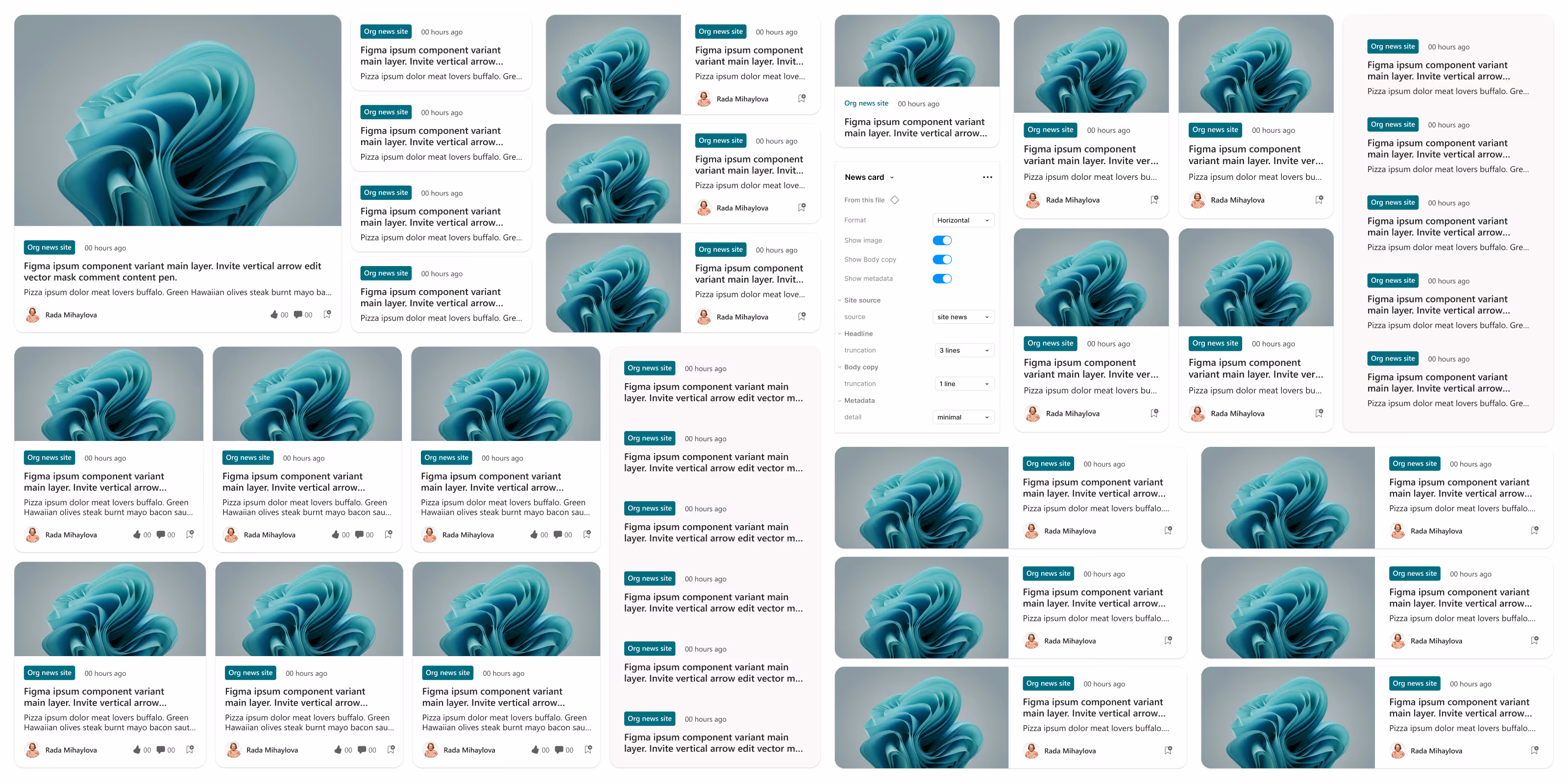
What actually shipped
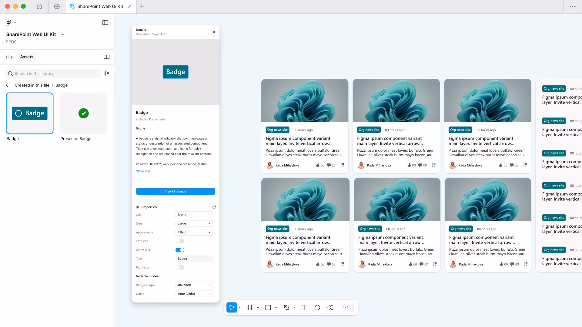
Design systems helped our teams communicate more clearly by establishing naming conventions and consistent terminology across design and code. The "kicker" element that was being used three different ways across the product? Fluent provided it as "badge." This not only provided an existing component but guidelines and documentation for usage that helped the feature team reconcile their differences.
A kicker that's a kicker, isn't a kicker - it's a badge.
The personal impact
This work didn't just happen to me, I architected it.
I saw gaps that others didn't recognize as problems. I built cases that made invisible work undeniable. I solved my way out of one role and into another by identifying where I could add the most strategic value. Most importantly, I discovered what I was genuinely passionate about: the intersection of systems thinking and setting teams up for success.
The trajectory shift wasn't Customer Success → Design Systems. It was recognizing that the skills I'd always had (seeing patterns, building infrastructure, advocating for better ways of working) could be applied at a completely different scale. Systems thinking isn't just about components and tokens. It's about understanding how organizations function (or don't), where the leverage points are, and how to create change that compounds.
What I learned: being a design system practitioner isn't about perfecting Figma files or shipping velocity metrics. It's about building the foundations that transform what an entire organization can accomplish. That's the work that actually matters.
That's the real impact. Not velocity. Not metrics. But fundamental transformation of what's possible.
reflection
The burnout reality nobody talks about enough
Design systems work is high-risk for burnout. Advocating and getting buy-in for adoption of a design system is hard. You're often viewed as a bottleneck. Your work gets broken by teams who don't understand it or deprioritized when features take precedence. Measuring impact is difficult when you're building infrastructure, not shipping user-facing features.
If you're not careful with how you manage your time, 100% of it can end up responding to support requests and being at the will of everyone else's roadmaps. You become purely reactive, constantly putting out fires instead of building the foundations that prevent fires in the first place.
I learned this the hard way. The key is setting boundaries and being strategic about where you invest your energy. Sometimes you have to say no to immediate requests so you can build the systems that make everyone more self-sufficient.
Most importantly: set yourself up for success by ensuring you have a great team and support system. You can't do this alone.
Start small and tailor your pitch
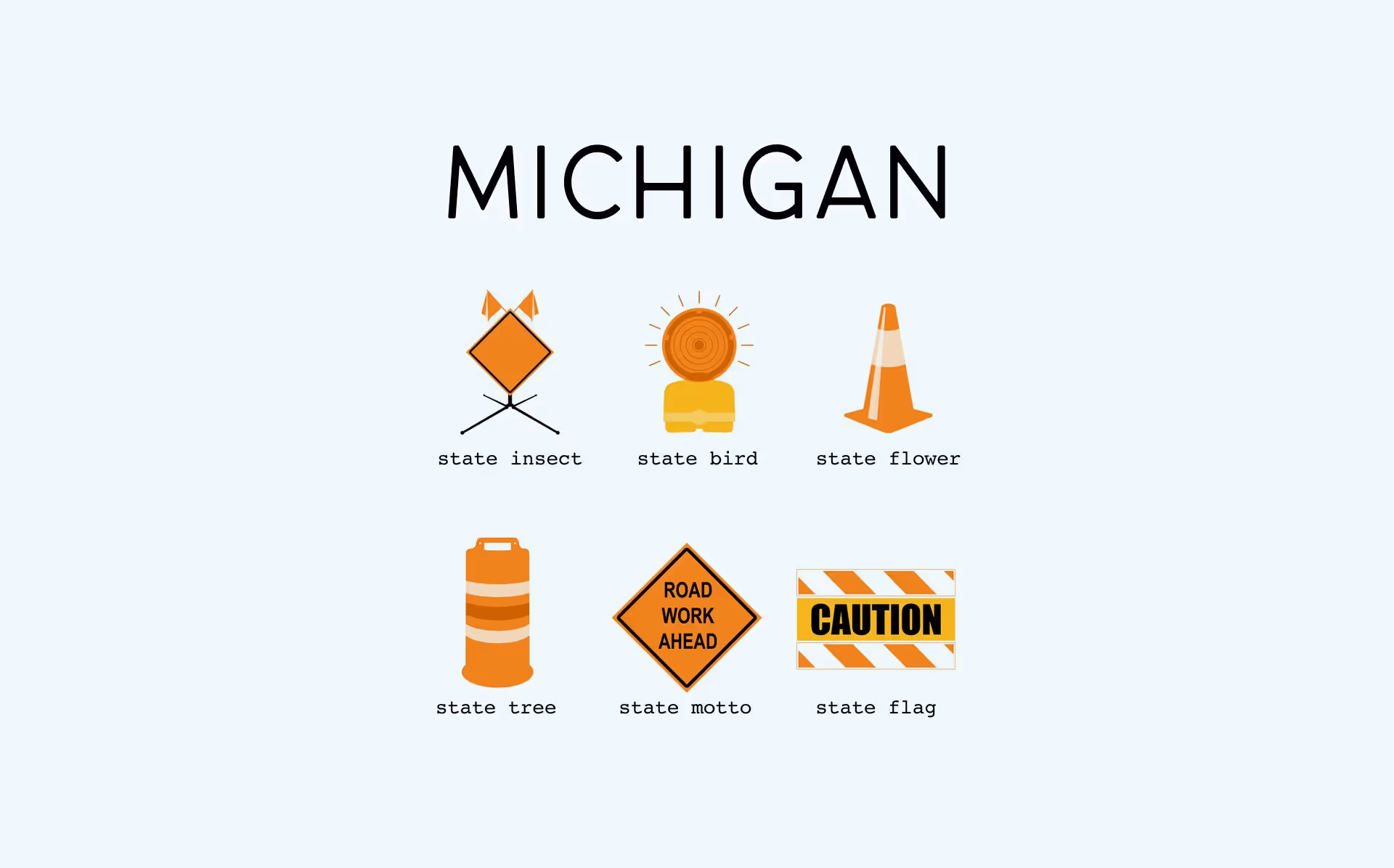
I grew up just outside of Detroit and it was a running joke that the state color is orange considering all the construction they were always doing. They always had these interesting signs that read "This short-term delay means long-term relief."
That became my framing when pitching the design system work. Yes, this will slow things down initially. Yes, this adds another layer of complexity. But the long-term payoff - speed to customer value, consistency, the ability to actually be a platform other products can build on - makes the short-term pain worth it.
The lesson: adjust your pitch accordingly. Tailor it to your audience so you can excite as many people as possible with all the ways a design system will benefit them. Engineers care about technical debt reduction. Product managers care about velocity. Designers care about consistency. Leadership cares about platform scalability. Same system, different value propositions.
Start small. Get a tactical win. Use it to build the case for bigger investment. Then keep iterating on your pitch as you learn what resonates with different stakeholders.
Build infrastructure that scales
I've been working in the product space for well over 12 years. Whether it's visual design, customer success, product design, or design systems, there's one throughline in how I approach my work: build infrastructure that scales.
What could easily be a chaotic, reactive role can - and should - turn into an opportunity to architect a scalable design practice. That's what the type audit was about. That's what the BUS tracking system was about. That's why I focused on training and documentation alongside the UI toolkit.
You can't personally solve every problem. But you can build systems that empower others to solve problems themselves. That's how you scale. That's how you avoid becoming the bottleneck.
A single source of truth is subjective
Most people believe Truth is a 'statement of fact' that is 'without falsehood', which is certainly one of the definitions, but a great philosopher once said…
you're going to find that many of the truths we cling to depend greatly on our own point of view
Obi-Wan Kenobi
Kenobi teaches that Truth is not necessarily an objective reality 'without falsehood' but often 'what we make of it' or a subjective truth.
"Code is the source of truth" — Developer
"Design is the source of truth" — Designer
"Truth is a shared responsibility" — Advocate
While each view is valid in its own way, how can only one be systemically true and able to grow and scale within an organization? At the end of the day, it doesn't matter what the designs and documentation say. It only matters what our customers are experiencing on a daily basis. Customer sentiment is the ultimate truth and everything else needs to change in service of that.