Building a brand system for scale
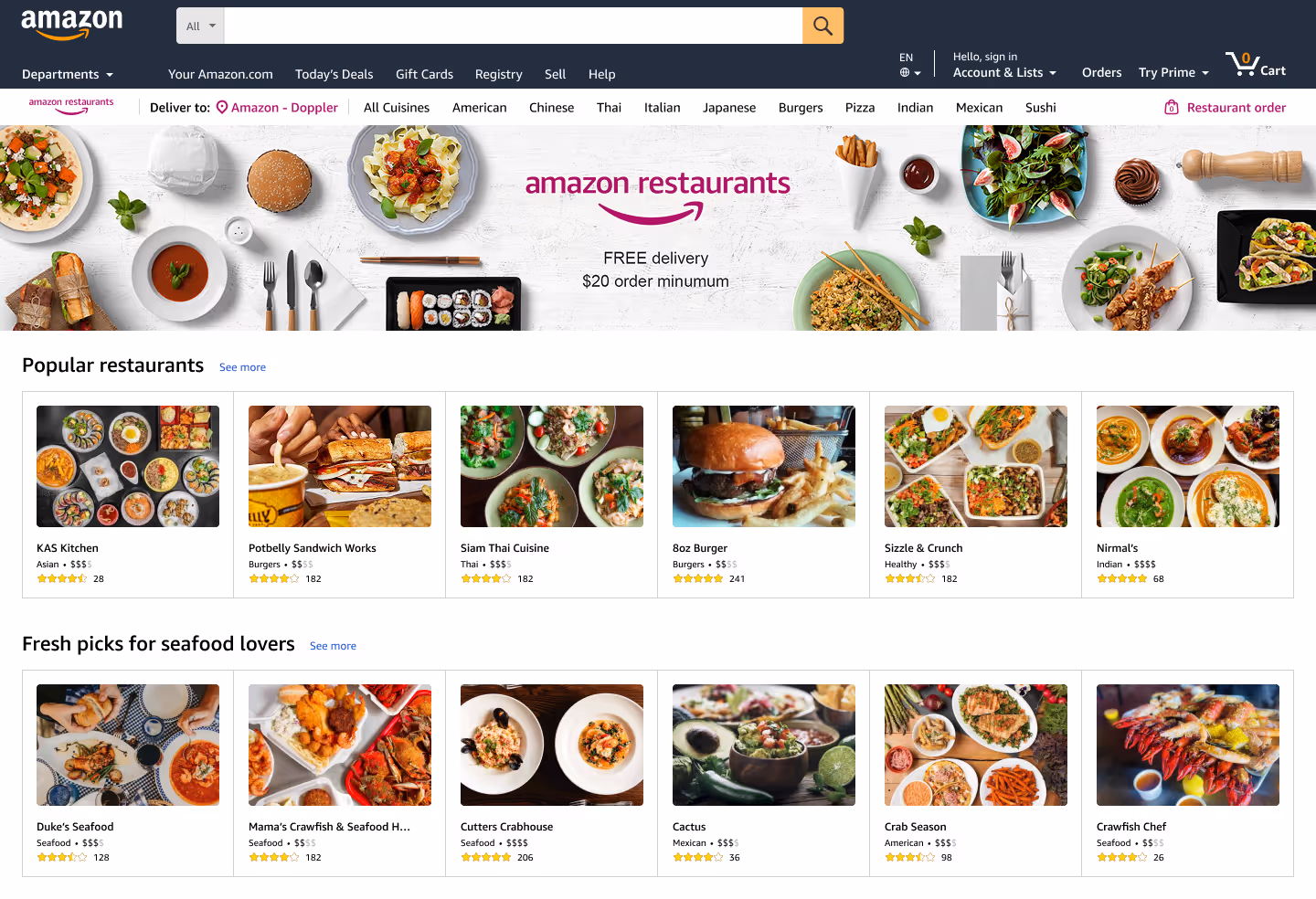
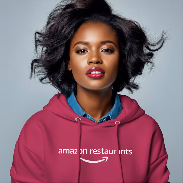
amazon restaurants
This case study details my journey over a six-month timeline in 2016. To comply with my non-disclosure agreement, I have omitted and obfuscated confidential information.
I partnered cross-functionally to translate strategy into systematic implementation while producing cohesive experiences across digital and print channels that supported brand updates, program roll-out, and various ongoing campaign goals.
A brief introduction
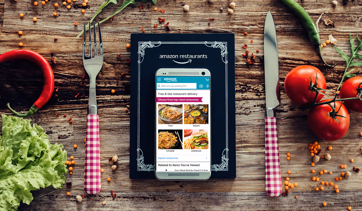
Having an extensive background in the food service industry and really wanting to take on a new challenge, accepting the role as a solo designer supporting a marketing team for a scrappy food delivery service within one of the world's largest companies felt like a dream come true. After a very short onboarding process I was tasked to create a complete brand identity that could hold its own against more established food delivery giants, such as Uber Eats, while also playing nice with Amazon's ecosystem.
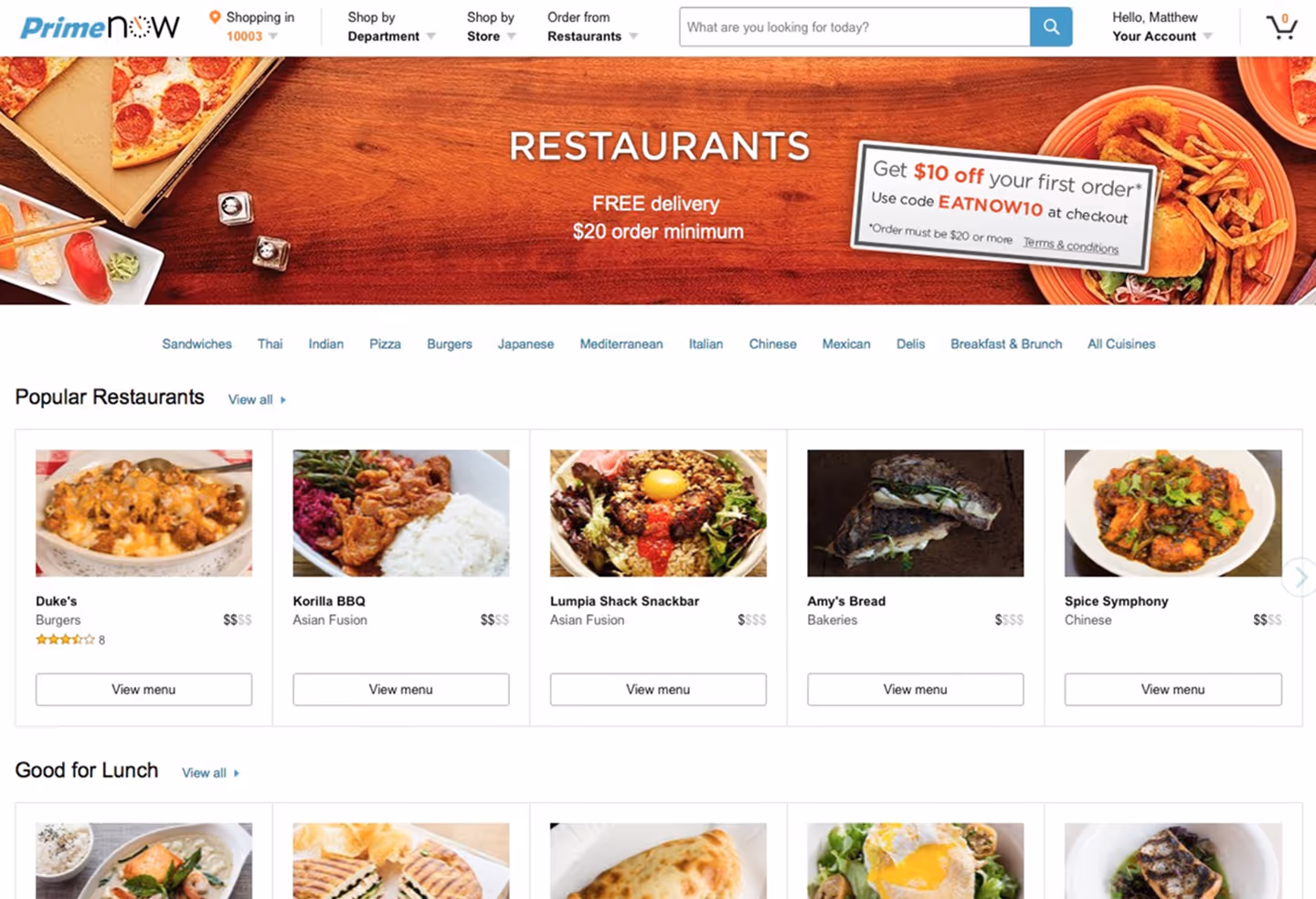
Amazon Restaurants had momentum—rapid user growth on Prime Now proved the concept worked. But transitioning to Amazon.com meant entering a visual thunderdome where every service was fighting for customer attention using variations of the same orange smile and helvetica. Without a distinctive identity, we risked becoming just another line item in an increasingly crowded services menu.
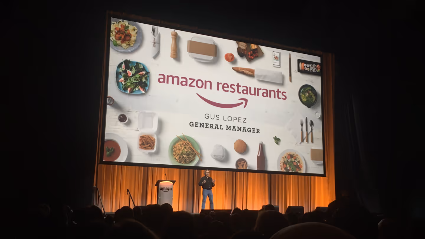
Basically, it's the Uber Eats of Amazon.
Guz Lopez, GM Amazon Restaurants
While the General Manager's introductory description during an employee all-hands made a perfectly accurate elevator pitch, it also highlighted our brand challenge—we were defined by what we weren't, not what we were.
problem
The business challenge
Amazon Restaurants was at an inflection point. We had validated product-market fit within the Prime Now ecosystem, but scaling to Amazon's main platform meant competing for mindshare among millions of daily visitors who were primarily there to buy everything except restaurant delivery.
The core tension
How do you create a memorable, distinctive brand that stands out within Amazon's ecosystem without breaking their carefully constructed visual language?
The design challenge
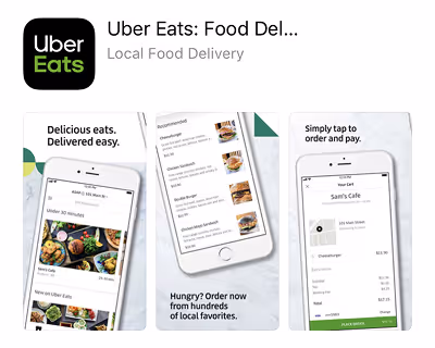
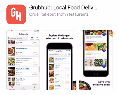
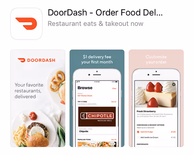
When I inherited this project, Amazon Restaurants had no brand identity beyond the Amazon name and a placeholder treatment. Meanwhile, our competitors had spent years building recognizable visual languages: Uber Eats' bold black and green, Grubhub's playful orange, DoorDash's clean red aesthetic.
Constraints
Operating as a solo designer within Amazon meant working with startup-level resources but enterprise-level brand guidelines. I had to navigate:
Amazon brand standards
Can't stray too far from the mothership
Technical limitations
The team was already deep into their 3rd sprint integrating into the Amazon infrastructure. Any changes were thrown into a v2 bucket to be kicked down the side of the mountain.
Resource constraints
No budget for external agencies, extensive user research, or custom photography
Timeline pressure
Working backwards from a fixed launch date. Marketing campaigns were already planned for next 3 city roll-outs, including launching in the UK.
What would success look like?
The real kicker was we had to do all of this while I was simultaneously fielding daily requests from marketing for campaign materials. It was like rebuilding a plane while flying it, except the plane was on fire and also we were being chased by a very well-funded competitors.
🙃 #nbd
process
Starting with what actually mattered
Not only did I need to get to know the folks I would be working with, but I needed to understand what the marketing team actually needed to succeed. So I did the decidedly unglamorous work of meeting with stakeholders across the organization to ask a simple question:
If I could give you one thing, even just a scrappy v1, that would help you hit your goals this quarter, what would it be?
The answers were revealing: Email templates for the growth team. Direct mail specs for regional sales. Social assets that didn't require a designer for every post. Nobody asked for a comprehensive brand guidelines document (thank god). They needed tools they could actually use, not beautiful PDFs they'd never open.
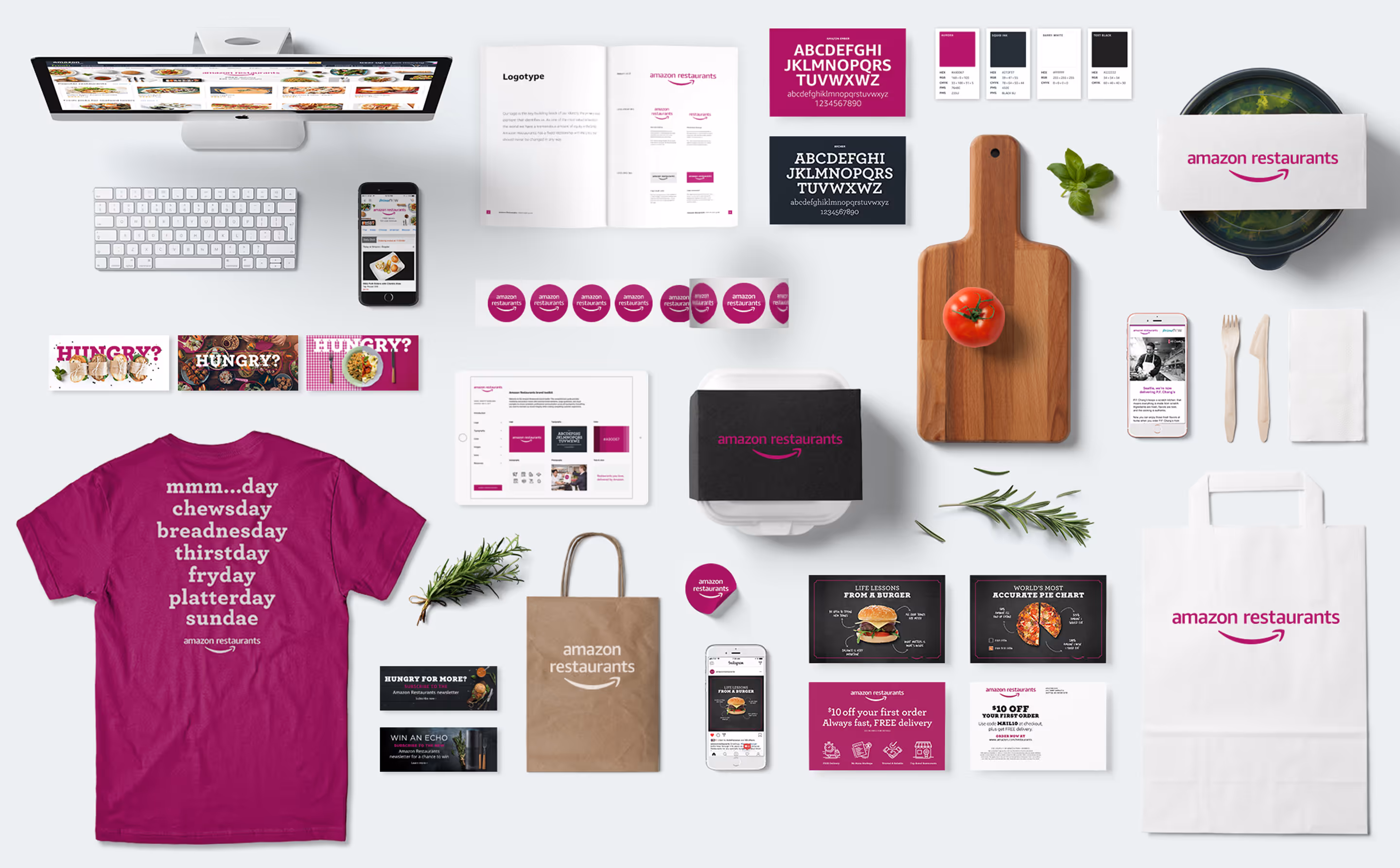
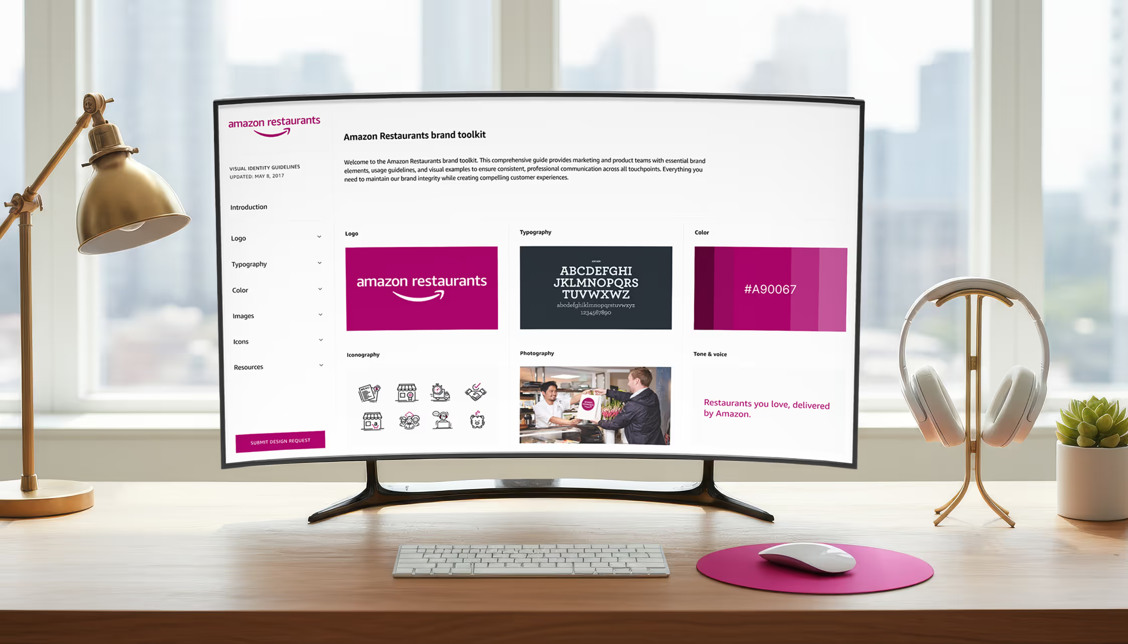
But here's what I knew they'd need eventually: a single source of truth. Somewhere they could find that logo file at 4pm on a Friday. A repository of approved graphics, fonts, brand color swatches and application guidance. A place where guidelines lived alongside actual resources.
So while I was churning out campaign deliverables, I was also quietly building a wiki. (Because if there's one thing Amazon folks love, it's a good wiki.) I was transparent about what it was: a living, breathing documentation site that would evolve as we learned what worked. Expect updates. Expect occasional direction changes. Expect Aurora to reveal more of her character as we went.
The beauty of framing it this way? Nobody expected perfection. They expected progress. And that gave me permission to build the brand system and document it simultaneously, rather than waiting for some mythical "we're done" moment that would never come.
This wasn't a traditional brand development process with extensive user research, A/B testing, and iterative refinement. This was startup speed within enterprise constraints. Most decisions were made in hallway conversations, validated through marketing performance, and refined based on what actually worked in the wild.
The beauty of this constraint? It forced me to focus on what mattered most: creating a system that worked for real campaigns with real timelines. That wiki I'd be quietly building would become a functional toolkit, not just pretty brand guidelines gathering digital dust.
Stakeholder navigation
Working without a direct manager for three months meant becoming my own advocate and project manager. My core team included:
Lead content designer
My closest collaborator on campaign development
Marketing team
The daily requesters and ultimate users of our brand system
VP of Restaurants
The final decision maker on brand direction
The key was learning to present design decisions as business solutions rather than aesthetic preferences. When the team started using only the brandmark, the smiling arrow, I didn't lead with "it looks unbalanced." I led with "we haven't earned the brand recognition to be identified by color alone, which means lower conversion rates."
Making work visible
When you're the solo designer supporting an entire marketing organization, "process" becomes about not drowning in requests while still shipping quality work.
The best decision? Turning the whiteboard behind my desk into a scrum board. It started as self-preservation. How else was I going to track social templates, three email campaigns, and that mysterious "branded something" for an upcoming presentation?
It became something more valuable: a living artifact of our priorities that anyone could see when they walked by my desk.

There's something powerful about making work visible. That whiteboard became an unintentional collaboration tool. Marketing could see what was in flight, leadership could understand capacity constraints, and I had a legitimate artifact to point to when someone asked "can you quickly mock up..."
Spoiler: it's never quick.
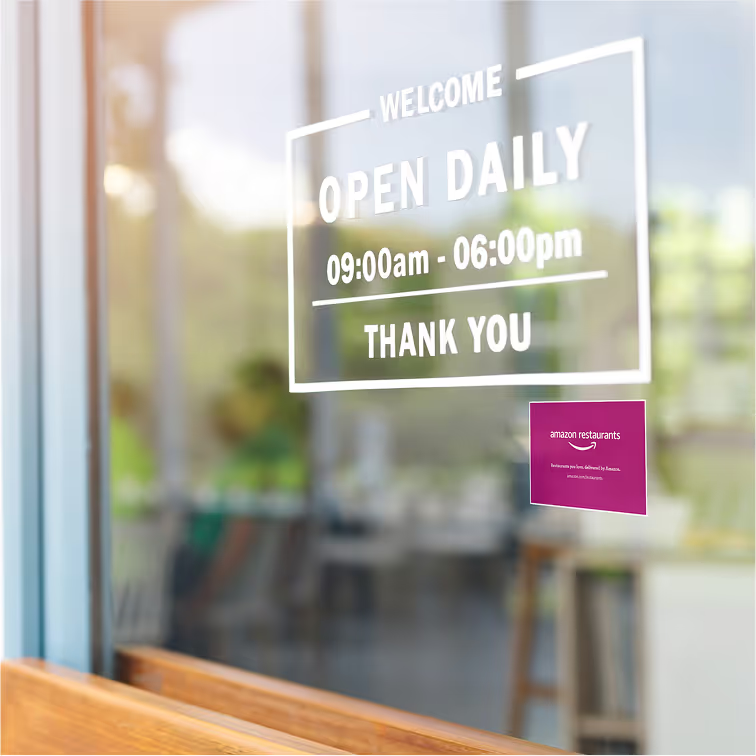
The logo reconciliation challenge
The product team had been hard at work on the new UI/UX necessary for moving from Prime Now over to Amazon.com. While working on the new designs, the UX designer had added a placeholder logo in his mocks.
In the world of agile development and tight timelines, this placeholder began its quiet march toward permanence. Engineering implemented it in the UI build. Teams needing vendor materials found it in the shared files and sent it along. Point-of-sale requests got fulfilled with "the logo we have." Nobody meant for it to become official, it just became the path of least resistance.
To be fair, the branded elements were smart choices for a quick mockup. Amazon Ember and the smile arrow provided instant brand recognition, and the smile arrow itself is a brilliant design. It literally connects A-to-Z, creating a visual moniker that reinforces Amazon's "everything store" positioning.
In practice, this created real problems. The smile arrow, designed to span from A to Z in "Amazon," looked awkward and unbalanced when centered under a two-word lockup. It created inconsistent white space that made layouts feel unstable, especially in mobile interfaces where space was already at a premium. When used with co-branding—as it often was with Prime Now—the centered alignment required by brand guidelines caused visual inconsistencies and size distortions that made the lockup feel amateurish.
I was also concerned about following Amazon's brand guidelines properly and more urgently, getting that rogue logo file out of circulation before it became permanently baked into every touchpoint. The train was already in motion.
How temporary became permanent
I reached out to the brand team early to understand how other Amazon sub-brands had navigated similar challenges. They walked me through Amazon Fresh's recent branding as a model showing how Fresh had handled the brandmark connection much more elegantly, maintaining visual hierarchy while preserving the smile arrow's integrity according to their guidelines.
Using Fresh as my north star and armed with the brand team's detailed guidance, I created logo variations that followed these established patterns. When I presented the work back to them, they gave me the thumbs up.
Armed with the brand team's approval, I looped in our leadership via email with the presentation and proposed updates, making the case for consistency across Amazon's sub-brands and replacing the non-compliant version already in use.
The reply-all from the VP of Restaurants made it very clear: we would not be changing the logo. The time for logo discussions had passed.
My approach became about finding creative solutions to work with the logo we had, not the logo I believe we should have had.
solution
Inheriting Aurora
When I joined the team, the Restaurant's brand color Aurora #A90067, had already been selected from Amazon's emerging design system palette. The rationale from senior leadership? "No one else was using it."
Not exactly the color theory masterclass I was expecting.
My first reaction was confusion, then mild panic. Here's this vibrant magenta that breaks every food industry convention. I didn't need to spend days diving into color psychology to rationalize why this would work for a food delivery service.
Then I realized I was approaching this backwards. The question wasn't "Is Aurora the perfect food delivery color?" It was "How do we make Aurora work brilliantly for food delivery?"
This shift in mindset became the foundation for everything that followed. Instead of fighting the constraints, I'd work within them to create something distinctive.
Being the solo designer on a growth team meant I couldn't conjure magic from thin air for every campaign. I needed a reliable cast of characters with Aurora as my versatile lead actress.

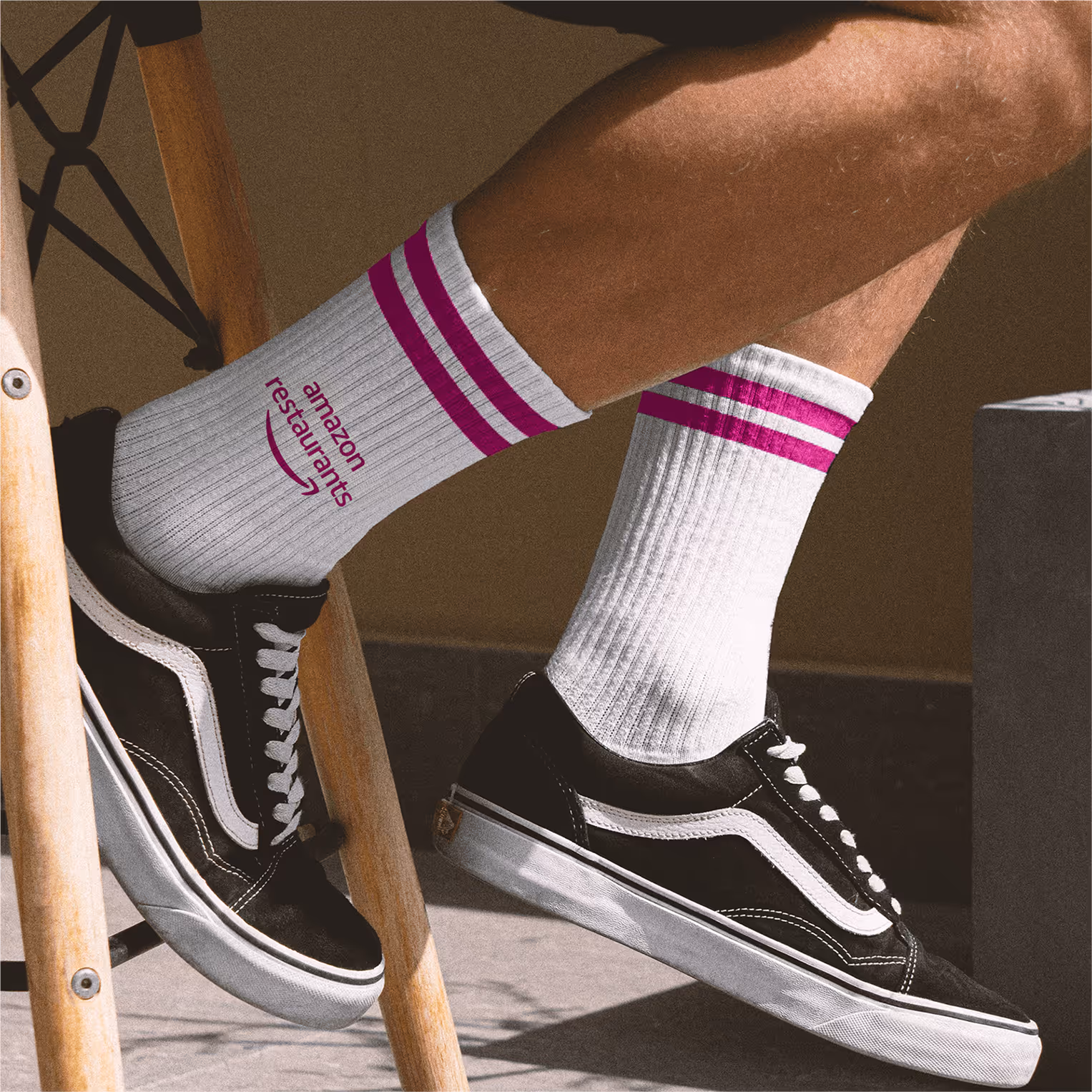
Meet Aurora, the shape-shifting protagonist
Aurora isn't just a pretty shade of magenta
She's the main character of our visual story, playing different roles depending on what the scene demands
Aurora in FMC mode
When it's showtime (those crucial brand moments and call-to-action scenes) Aurora steps into the spotlight as our Primary Aurora. She's bold, confident, and commands attention. This is Aurora at her most powerful, the version that converts browsers into buyers.
Aurora in NPC mode
Aurora knows when to step back and let other elements shine. In her supporting role, she becomes part of the scenery:
The Infiltrator
She sneaks into stock photography, replacing mundane reds with her signature magenta and suddenly that napkin isn't just any napkin, it's our napkin.
The Stage Manager
She creates dramatic backdrops that make food photography take center stage, knowing exactly when stark white and deep black need to enter the scene.
The Matchmaker
She introduces complementary colors to the cast, orchestrating perfect color harmonies that feel effortless.
World-building as System-building
Think of it this way: Aurora isn't just living in our brand world, she's actively building it. Every color choice, every typographic pairing, every moment she decides to dominate or defer creates the rules of our visual universe.
The beauty is that Aurora can improvise within her character. Need a subtle brand touch? Aurora fades into the background, a gentle reminder of who we are. Need to drive action? Aurora takes the stage, impossible to ignore.
This isn't just a design system - it's Aurora's character arc, and she's written into every corner of our brand story.
Damage control as design strategy
Remember that placeholder logo that became permanent? Once the decision was made to stick with it, my approach shifted entirely: work with what we have, not what we wish we had.
My solution: damage control through creative accommodation.
I refined the typesetting and alignment to create flexible lockups that worked across different aspect ratios and contexts. The key moves:
Lockup variations
optimized for horizontal, vertical, and square formats
Creative white space management
using design elements to balance the logo's proportions
Strategic placement guidelines
where the logo's quirks became less noticeable
Getting it into the wild
When I finally got access to our team's CDN, I swapped out the rogue files with the refined versions.
Then came the most crucial part: getting everyone on the same page.
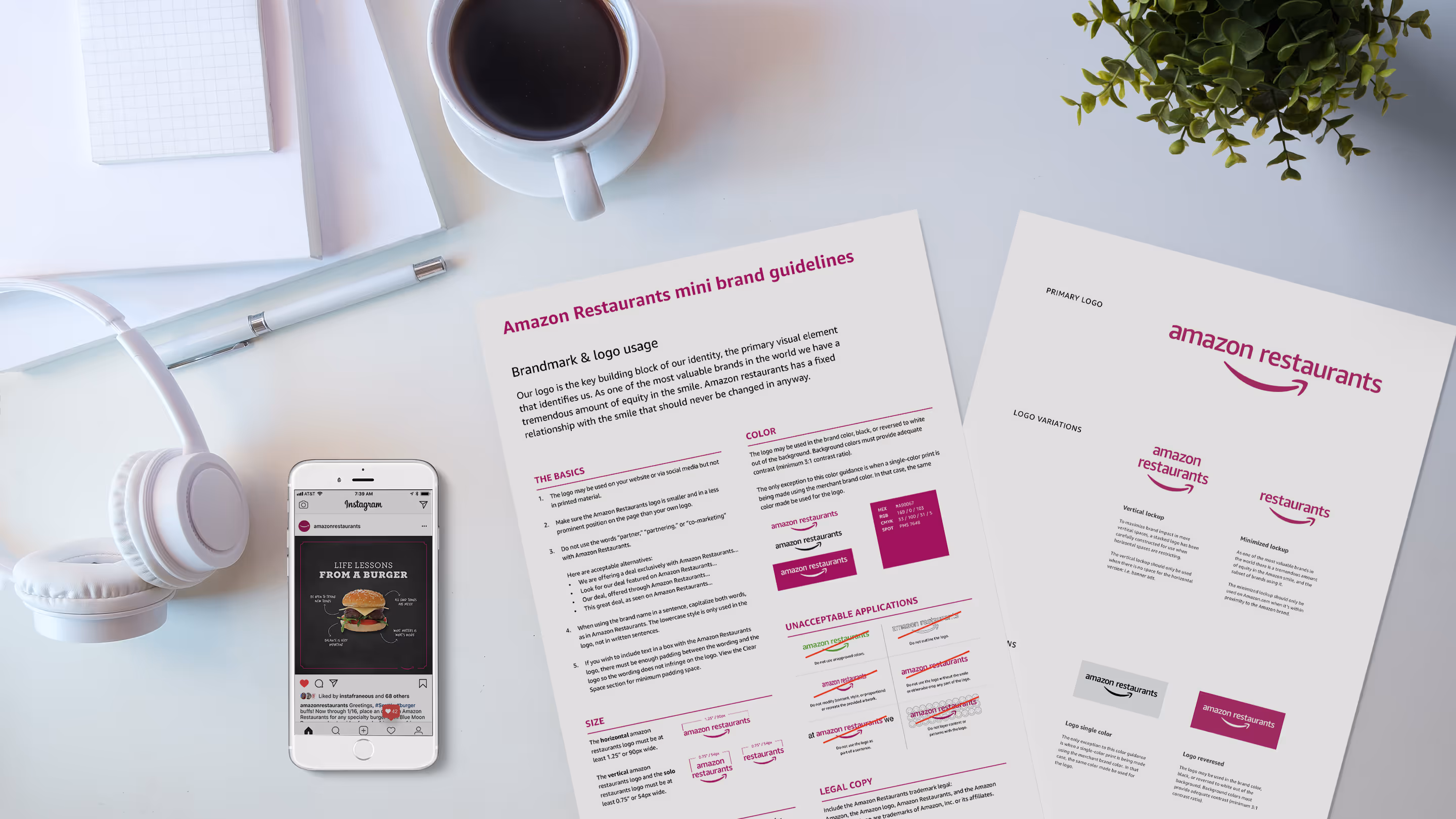
I drafted an internal newspost for the extended team announcing the updated brand toolkit wiki. No fanfare, just a straightforward here's where to find everything you need.
The goal wasn't perfection, it was consistency and accessibility. Give people the tools they actually need, make them easy to find, and document the rationale so they understand the why behind the decisions.
Sometimes the most important design work isn't creating beautiful brand guidelines, it's making sure the right files end up in the right hands at 4pm on a Friday when marketing needs to meet a deadline. But don't get me wrong, I still think it's important to always deliver quality not just quantity.
Building systems under fire
The reality of being a solo designer on a growth team meant I couldn't afford to design everything from scratch for each campaign. I needed systems that would let me (and eventually the marketing team) work efficiently while maintaining brand consistency.
Let's time travel a bit. This is 2016, before Canva, before Figma, before any of the tools that make asset production remotely manageable. No brand template libraries where teams can spin up social posts in minutes. No "duplicate and customize" workflows. Just me, in a blossoming relationship with Sketch and Adobe, and an ever-growing list of deliverable requests.
On top of the extensive specifications required for Amazon's main platform graphics, there were countless slot alignments needed for Prime Now. I was drowning in requests, and I needed to get strategic fast.
The template triage
My first move was reconciling what seemed like an infinite request list down to what was actually most impactful. This wasn't about limiting the team's creativity. It was about creating a sustainable design practice that could scale.
The key insight: if I could templatize it, I could deliver it faster and more consistently.
This gave the team predictable SLAs and gave me bandwidth to focus on work that required actual customization. This simple framework transformed the request process from "can you design this?" to "which template works for this, or why do we need something custom?"
Template based thinking
Every deliverable became an opportunity to create a reusable system. Having a prioritized list from my initial stakeholder conversations let me focus on what could be systematized versus what needed flexibility.
What got templated:
Email campaigns that marketing could customize with new copy and imagery
Social media assets that maintained consistency across platforms
Direct mail layouts that could scale across different offers and markets
Launch-specific packages for all digital and print deliverables that worked across markets
Email campaign architecture
Rather than designing each email from scratch, I built a modular system based on interchangeable content blocks—think LEGO bricks instead of custom sculptures. This wasn't just about efficiency (though that mattered), it was about creating a foundation that could scale with our ambitious launch schedule.
Building blocks, not one-offs
The modular block system
Working closely with a front-end engineer, we built out flexible components with customizable properties that marketing could configure without touching code. Each block was self-contained but designed to work seamlessly with any other block combination.
Copy Block
The workhorse of our email system. Every text element included show/hide toggles and alignment options (center or left), giving marketing control over hierarchy and layout without requiring multiple template variations.
Card Component (ASIN blocks)
The real MVP of our system. We standardized on a single card component that powered multiple layout configurations and built in properties to allow personalization through toggling items on or off.
Single column
Full width hero display perfect for featured restaurants
Two column
Restaurant grids and comparison layouts
Orientation options
Vertical or horizontal display to help break up the visual monotony
The genius was in the properties. Each card included show/hide toggles for:
Asset imagery (with consistent 4x3 aspect ratios—more on that in a moment)
Tag labels ("Now available," "Local favorite," "Most ordered")
Headings (restaurant names, dish names)
Body copy (cuisine descriptors, promotional copy)
CTAs (button vs text link)
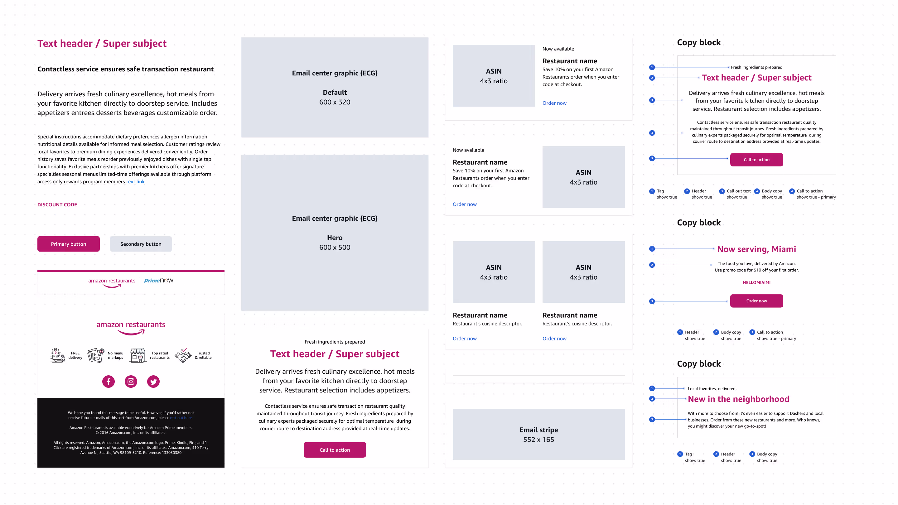
Hero Blocks
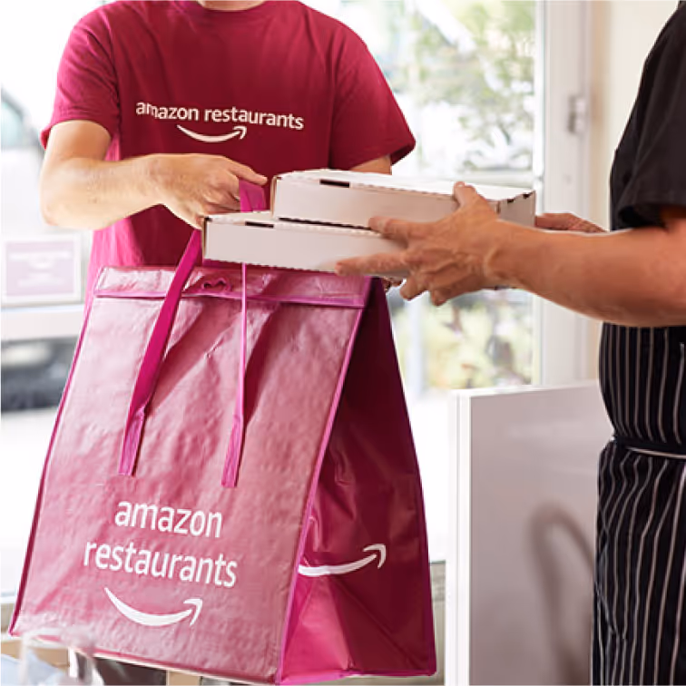
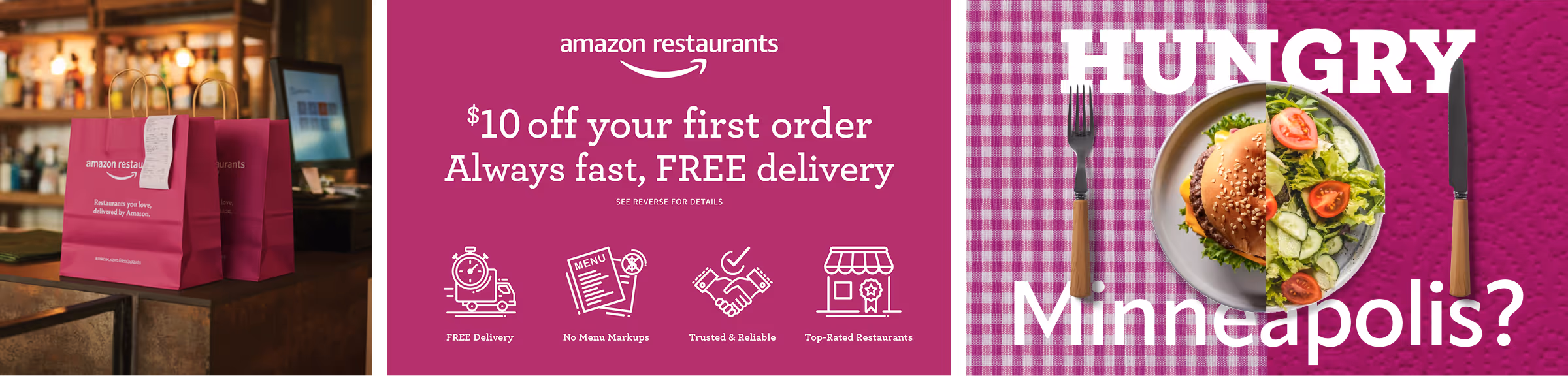
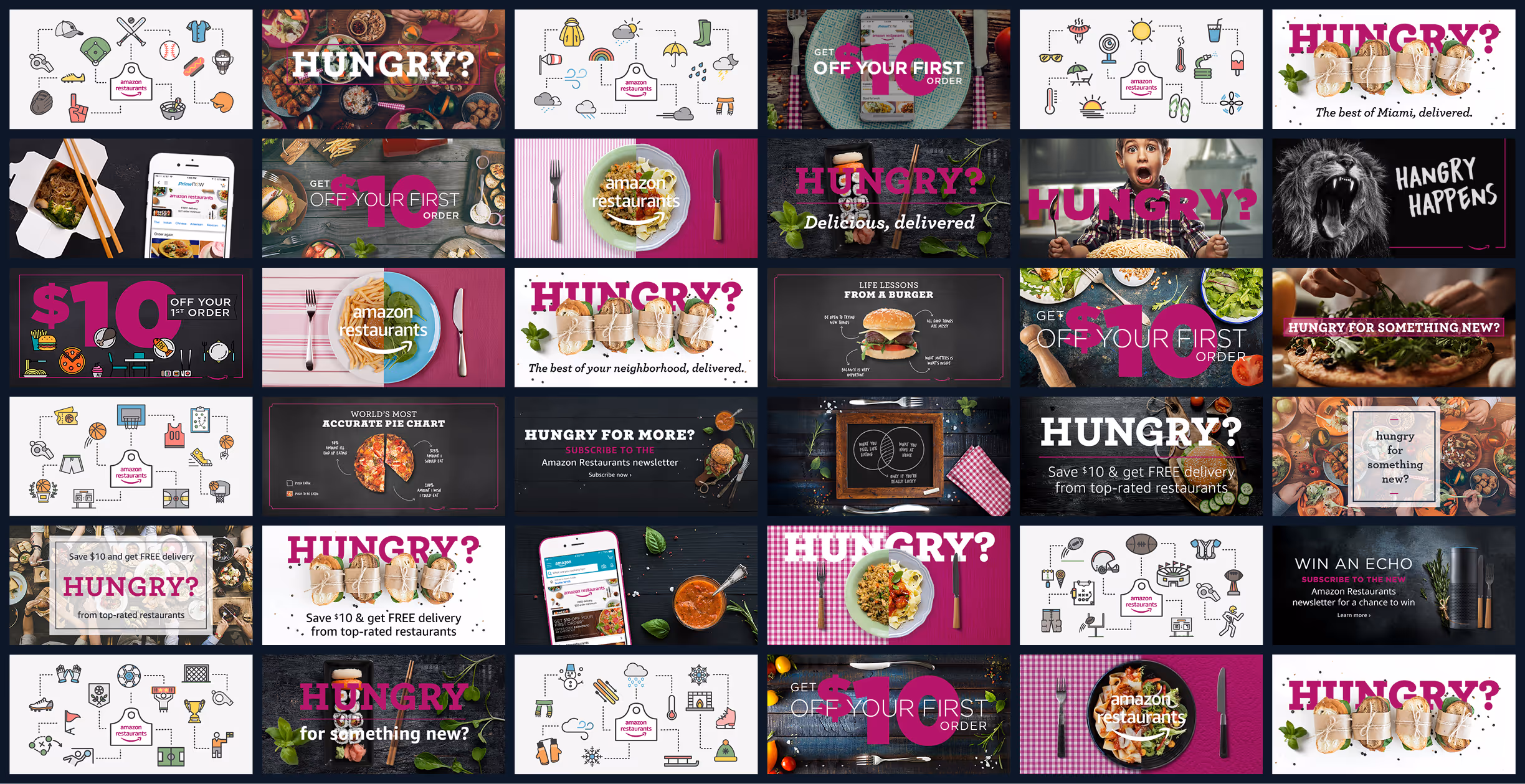
Large-format promotional blocks with Aurora accent treatments that could accommodate any food photography while maintaining brand consistency. These worked for everything from seasonal campaigns to new market launches.
Promotional Callout Blocks
Aurora really commanded attention here. These blocks used bold Aurora backgrounds for discount codes, limited-time offers, and first-order incentives—designed to be impossible to miss in a crowded inbox.
Email Stripe
Full-width blocks for announcements, newsletter signups, or visual breaks between content sections. Simple, clean, and effective for pacing longer emails.
The aspect ratio breakthrough
Here's where systematic thinking paid massive dividends: by standardizing all imagery to 4x3 aspect ratios, we solved two problems simultaneously.
Production efficiency: No more custom image sizing for every campaign. Marketing and sales teams could source restaurant photography knowing exactly what dimensions they needed. The photography repository I built followed this same spec, creating a library of ready-to-deploy assets.
Layout consistency: Cards maintained visual balance regardless of content. A grid of restaurant cards felt cohesive even when featuring completely different cuisines or promotional offers.
The real power of modular thinking
This modular approach meant marketing could assemble complex, on-brand emails without designer intervention for standard campaigns. The system encoded brand decisions, so even non-designers could create emails that felt cohesively "Amazon Restaurants."
That's the difference between being a product designer and being a production designer. I wasn't making prettier emails—I was building infrastructure that let the team move at the speed of their ideas while maintaining brand integrity, while also making them look good.
Direct mail consistency at scale
Working closely with a marketing team member, I sourced and onboarded an approved vendor, providing them with template files that stakeholders could customize for regional or specific needs.
The vendor handled printing, targeted lists, and data management processing turning what could have been 500K+ individual decisions into a systematic, self-service workflow.
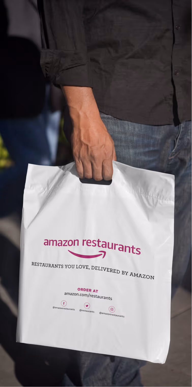
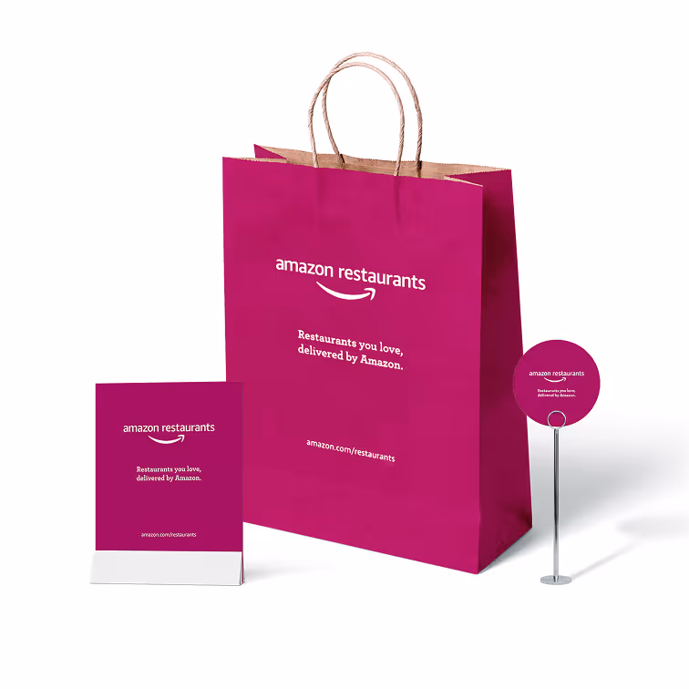
Every mailer incorporated Aurora strategically:
The template structure meant regional launches could spin up quickly without sacrificing brand consistency, and stakeholders could execute campaigns without designer or marketing bottlenecks.


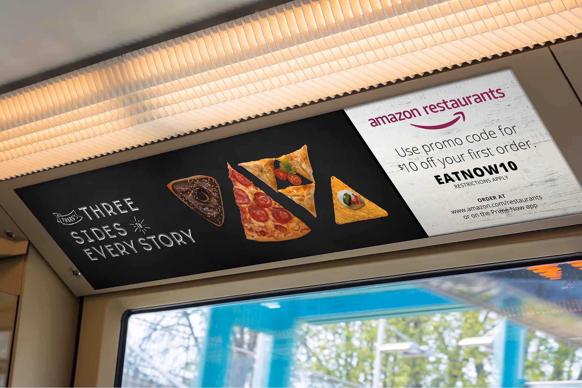
Out-of-home scalability
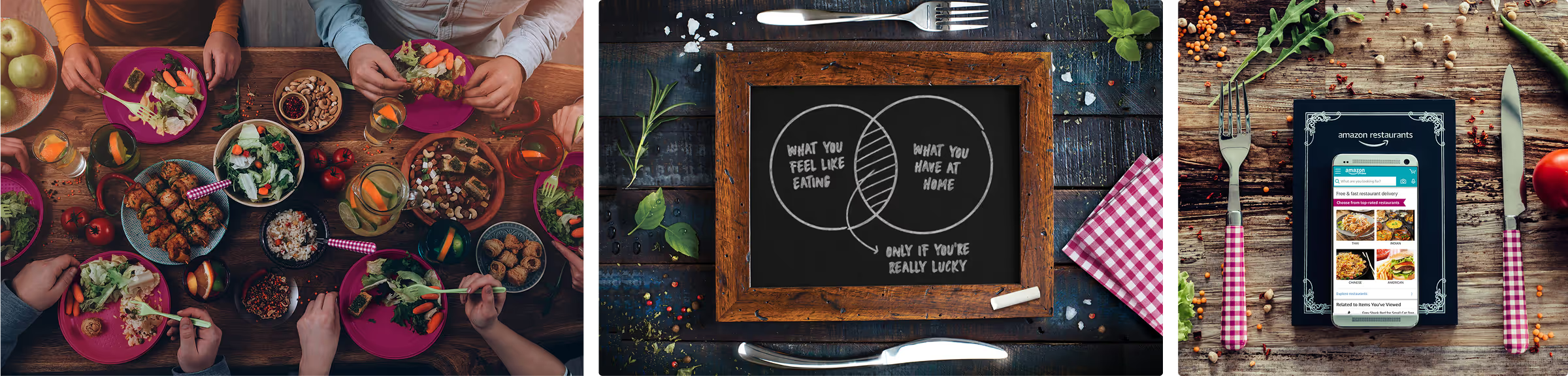
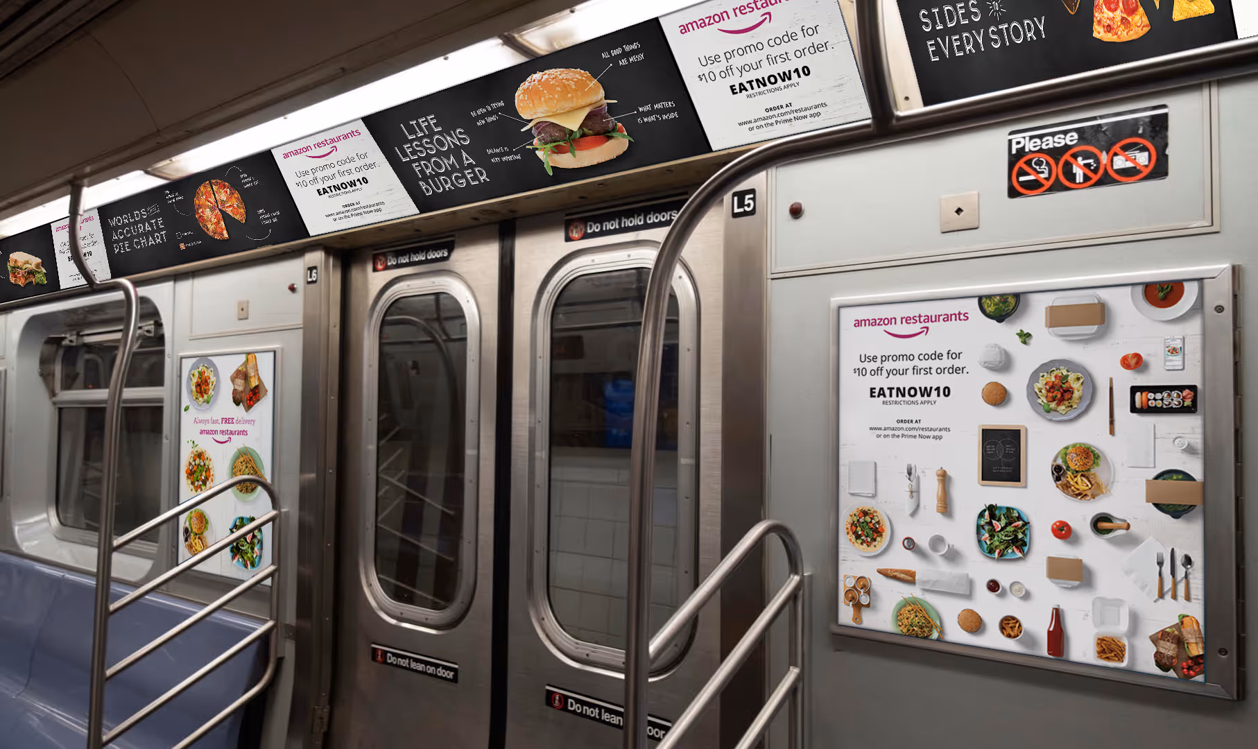
The Chicago subway campaign proved the system's flexibility under pressure. With a tight turnaround, I didn't need to start from scratch—the visual language from email and direct mail translated directly to OOH (out-of-home). White backgrounds, Aurora accents, and food-forward photography maintained brand consistency at train-speed viewing, while the existing framework freed me up to explore custom elements like the chalkboard typography that gave the campaign personality.
Commuters seeing those train ads, then receiving email campaigns, then getting direct mail pieces experienced a cohesive brand story. The templates weren't limiting creativity—they were ensuring consistency across every touchpoint, whether I touched them directly or not.
What this actually solved
This wasn't just about making my life easier (though it did). The template system created:
When you're the only designer supporting an entire marketing org, templates aren't a nice-to-have. They're survival strategy.
impact
From color choice to complete system
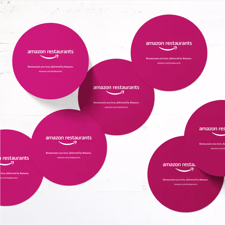
What started as "no one else was using it" became a comprehensive brand ecosystem. Aurora wasn't just a color anymore. It was the foundation for everything from email templates to branded merchandise to iconography systems.
The power of centralized truth
Here's the thing about being a solo designer supporting an entire marketing org: you can create the most comprehensive brand guidelines in the world, but if no one can find the logo file at 4pm on a Friday, none of it matters.
My brand toolkit wiki wasn't some elaborate digital asset management system, it was an internal site designed to do one thing exceptionally well: provide value when people needed it most.
A single source of truth meant digital files became discoverable, shareable, and secure. The marketing team could access what they needed without hunting through scattered folders or interrupting workflows. Efficiency improved, brand consistency strengthened, and collaboration became frictionless.
Asset creation became intentional rather than reactive. Redundancy decreased. Using an internal platform meant access and permissions could be controlled, protecting sensitive content while ensuring the right people had what they needed.
Would I have loved data-driven insights tracking asset performance and engagement? Absolutely. Analytics showing which templates were used most frequently would have helped refine the system iteratively. But perfect is the enemy of done, and what mattered was building a system that enabled the team to execute independently while maintaining brand integrity.
Email system transformation
The modular email architecture proved its value immediately through measurable workflow improvements and team autonomy.
Marketing autonomy unlocked: Implementing and advocating for the need to build in additional properties into the handful of components we build meant marketing could assemble emails using the same base components but create entirely different layouts. Need a simple "hero image + CTA" announcement? Use one card, hide everything except the image and button. Need a "browse restaurants in your neighborhood" grid? Deploy eight cards in 2x4 configuration with all properties visible. What used to require 5-7 days of custom design work became 1-2 hours of self-service configuration.
Engineering efficiency multiplied: Building properties into components meant the engineer wrote the code once, and we leveraged it infinitely. Adding a new card to an email wasn't a dev ticket—it was a configuration marketing could make themselves in our email platform. This freed up engineering capacity for product features instead of marketing requests.
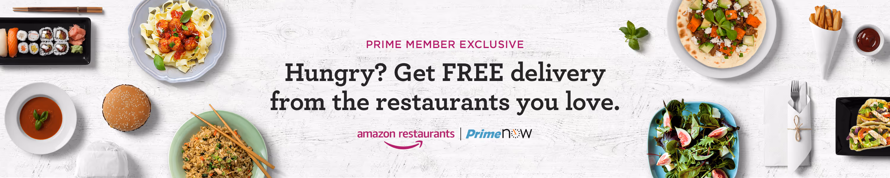
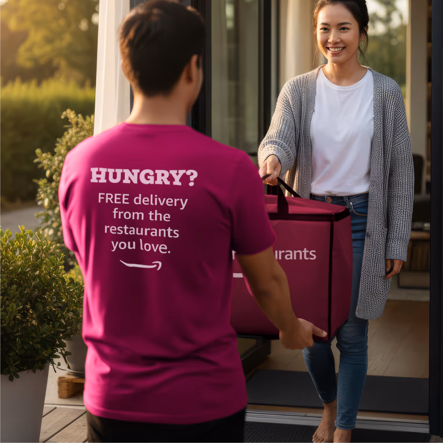
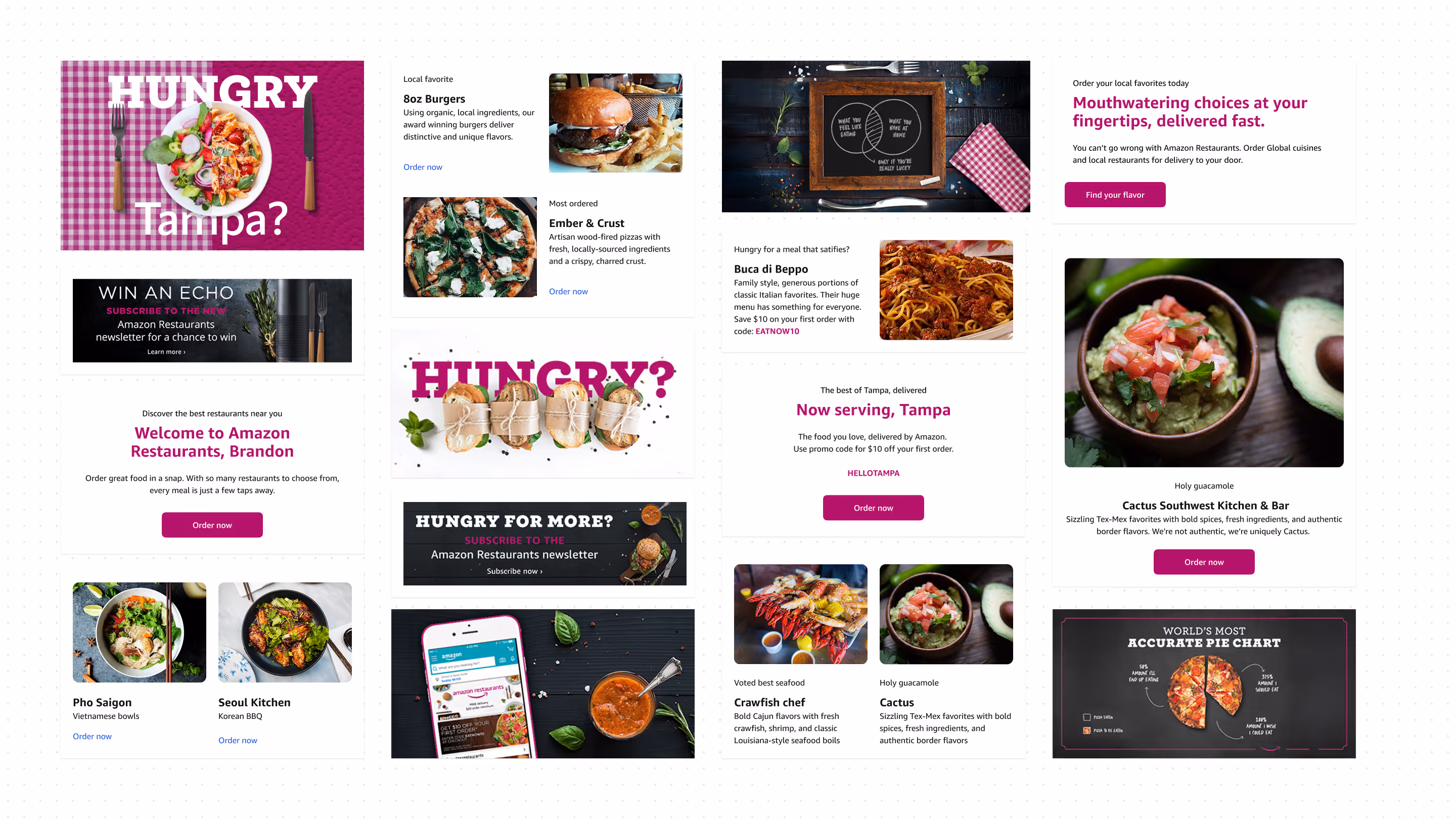
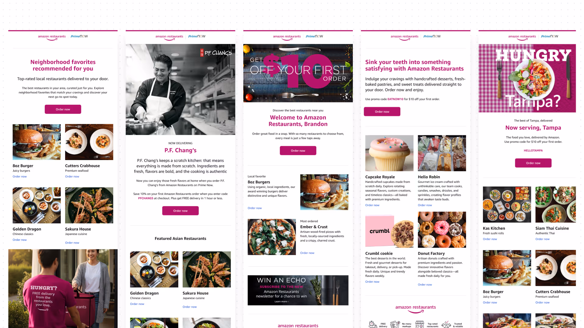
Production velocity: The "Hungry?" campaign structure became the go-to format for promotional emails, deployed across multiple markets with consistent brand expression. Marketing could plug in new copy, swap restaurant photography (all standardized to 4x3 ratios), and adjust offers without designer intervention.
Rapid market expansion: Launching in Tampa, Miami, or London meant swapping restaurant content within the existing card structure—not rebuilding email templates from scratch. Regional launches that would have taken weeks of design work happened in days because the infrastructure was already built.
Asset production streamlined: Standardizing imagery to 4x3 aspect ratios created a virtuous cycle. The photography repository I built followed this spec, sales teams knew what dimensions to request from restaurants, and marketing could pull from a growing library of ready-to-deploy assets. No more "can you resize this image for email?" requests.
Reduced revision cycles: Clear component properties meant fewer arbitrary change requests. Marketing understood exactly what was configurable (show/hide tags, alignment options, CTA styles) versus what maintained brand consistency. This reduced back-and-forth and let campaigns ship faster.
Designer role transformation: My involvement shifted from producing every email to maintaining the system and creating custom components for special campaigns. Instead of being the bottleneck, I became the system architect—higher value work that actually required design thinking rather than production skills.
The measurable impact
Campaign turnaround times
5-7 days went down to 1-2 days using the template
Marketing self-sufficiency
~70% of emails assembled without designer involvement
Request queue transformation
Requests shifted from "make a social post announcing San Diego launch" to "we need a custom illustration for the birthday campaign"—higher value work, less production tedium.
Multi-channel operational efficiency
The systematic approach to email architecture extended across all marketing channels, creating consistent efficiency gains.
Direct mail at scale: The templated approach meant 500-800K monthly mailers could be executed through our vendor partner without designer intervention. Regional launches spun up quickly, and stakeholders could customize and deploy campaigns independently while maintaining brand consistency.
Social media velocity: Launching in a new city meant a flood of social content announcing availability, showcasing restaurants, and driving initial orders. Template systems enabled quick turnaround without sacrificing brand integrity.
Marketing could move at the speed of their ideas, not the speed of design requests.
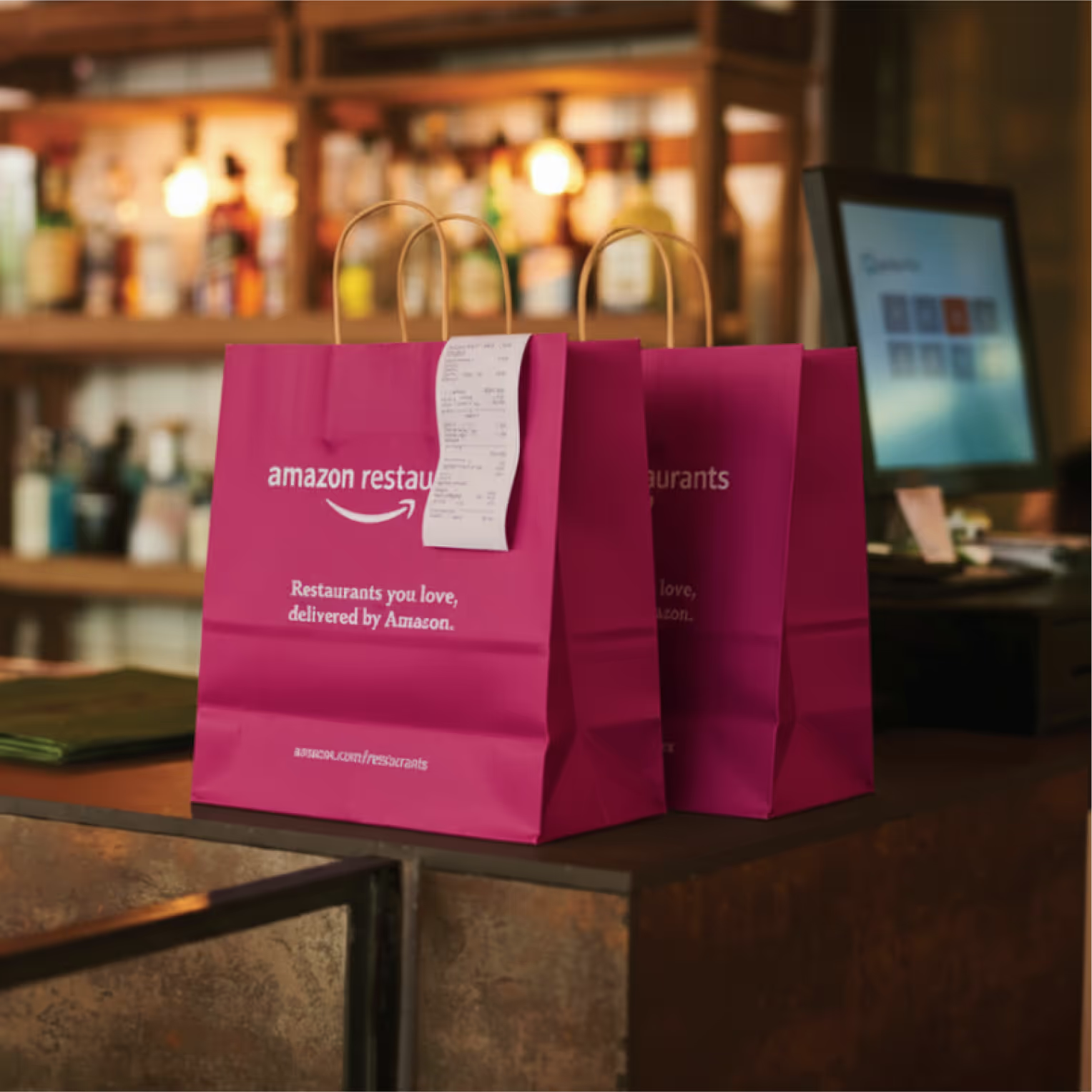
Photography repository as force multiplier: With zero budget for photoshoots, I built a comprehensive repository of approved imagery—stock photography treated with Aurora overlays, color replacements, and consistent styling. This library became a self-serve resource for the marketing team, enabling them to find and deploy imagery that maintained brand standards.
The repository wasn't just a collection of images; it was a systematic approach to visual consistency under significant resource constraints. The 4x3 aspect ratio standardization for all restaurant ASIN thumbnails meant images worked seamlessly and batching edits was streamlined.
Cross-channel brand cohesion: The Chicago subway campaign showed how the systematic approach enabled rapid execution without sacrificing creativity. Because the foundational visual language was already established, a tight-turnaround OOH request became an opportunity for custom flourishes rather than a scramble to define basics. Commuters seeing those subway ads, then receiving emails, then getting direct mail experienced a unified brand story—the system ensured consistency across every touchpoint, whether I was directly involved or not.
Brand recognition momentum
External validation: Aurora in the wild
Being part of Amazon gave us immediate credibility, that's the benefit of playing on a winning team. But establishing our own identity meant consumers could recognize and recall the brand based on distinctive visual cues—logos, colors, typography, tone—independent of the Amazon mothership.
Brand recognition isn't just "people have seen your logo." It's being distinguished from competitors in the minds of consumers, which in a crowded food delivery market meant everything.
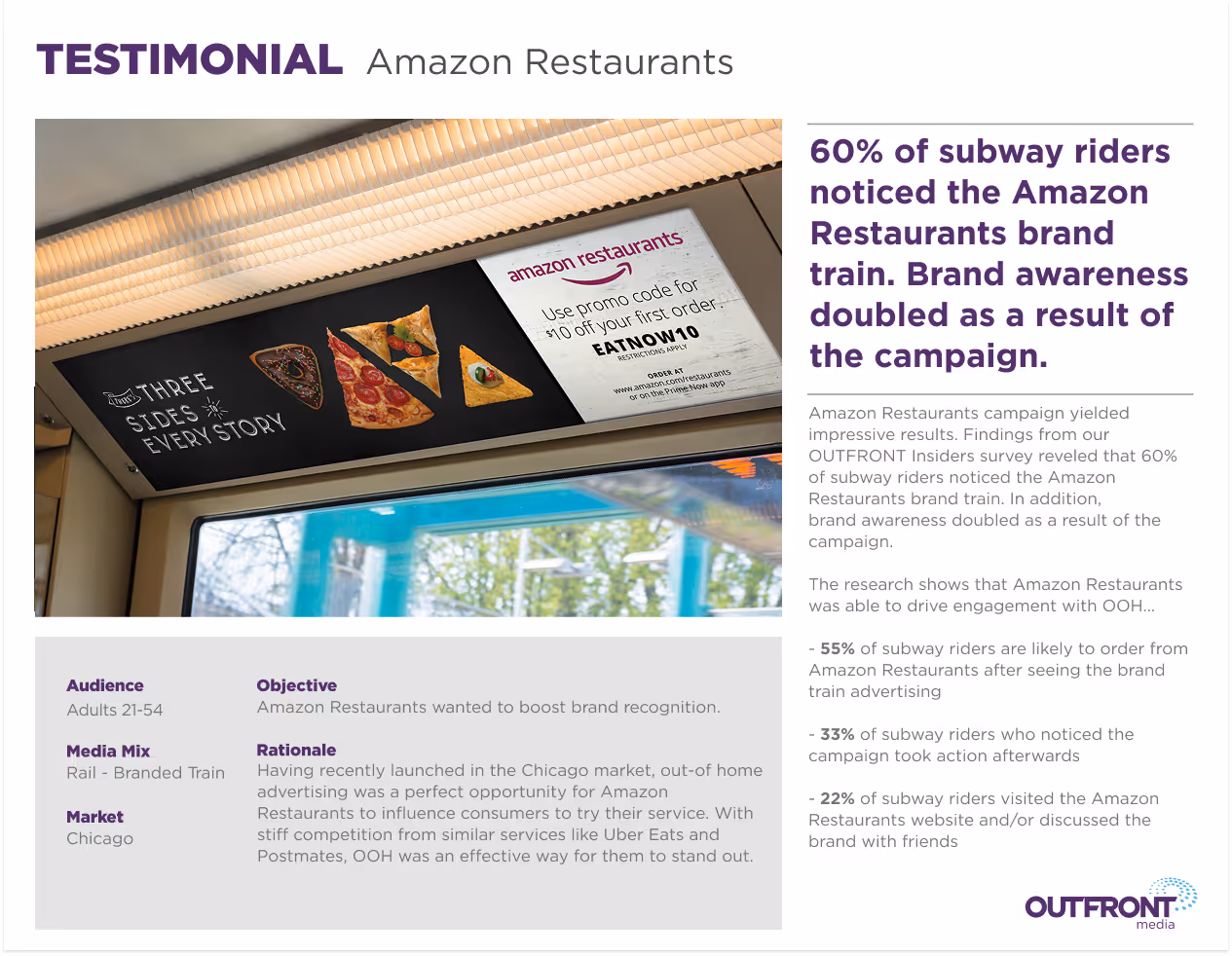
The Chicago subway campaign proved the system worked:
60% of subway riders noticed the Amazon Restaurants brand train. Not just glanced at it while scrolling their phones, but actually noticed it. Brand awareness doubled as a result of the campaign. These weren't Amazon shoppers seeing ads nestled in their app. These were commuters on the brown and red lines who could now identify our brand in the wild.
More telling: 55% of riders said they were likely to order from Amazon Restaurants after seeing the campaign. That's not brand recognition—that's brand consideration, the holy grail of marketing metrics.
The consistency of brand application across all channels—those recognizable Aurora accents, the photography treatments, the typographic hierarchy—created memorable visual elements that stuck. Strategic marketing campaigns didn't just introduce the brand; they reinforced it at every touchpoint.
Why this mattered beyond vanity metrics
Consumer trust: High brand recognition builds trust. Consumers are more likely to choose products or services from brands they recognize, especially in categories like food delivery where trust directly impacts ordering behavior. When you're handing your credit card to a service bringing food to your door, brand recognition equals peace of mind.
Competitive advantage: In a crowded market dominated by Uber Eats, Grubhub, and DoorDash, strong recognition gave us a fighting chance. Consumers often default to familiar brands when faced with choice overload. Being recognizable meant being considered.
Marketing efficiency: Every dollar spent on marketing worked harder when the brand was easily identifiable. Recognition led to increased customer engagement and loyalty, shortening the path from awareness to conversion. Instead of explaining what Amazon Restaurants was every time, the focus could shift to why someone should order tonight.
The systems thinking advantage
This operational transformation wasn't accidental—it was the result of approaching every deliverable as an opportunity to build reusable infrastructure. Every template created reduced future cognitive load. Every guideline documented decreased decision-making friction. Every asset organized became instantly accessible.
Creative range within consistency
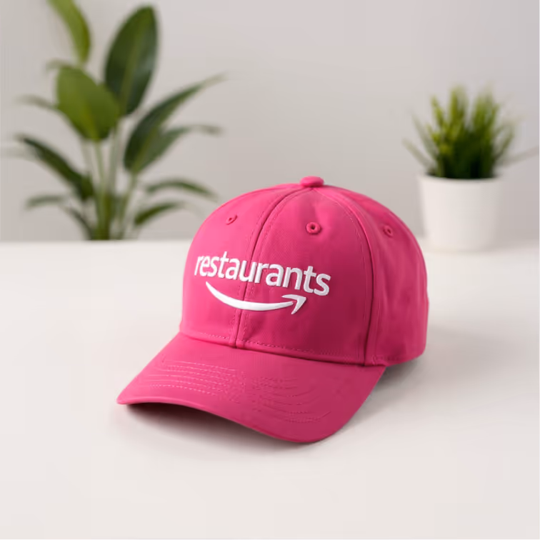
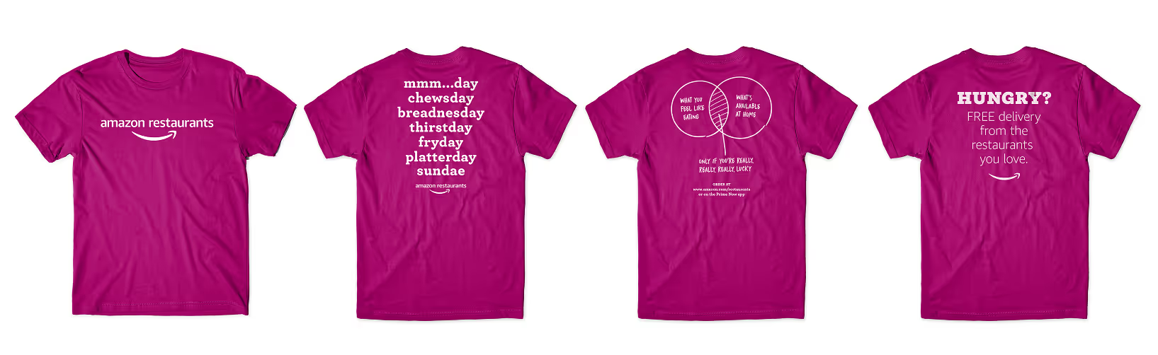
The system proved flexible enough to support everything from straightforward promotional campaigns to personality-driven pieces like "Life lessons from a burger" merchandise and the cheeky "mmm...day, chewsday, breadnesday" wordplay. Aurora could be sophisticated or playful, promotional or brand-building—the system had room for creativity within consistent boundaries.
Legacy impact
Amazon Restaurants may have sunset in 2019, but the brand system demonstrated something valuable: a solo designer could create comprehensive, scalable design systems within enterprise constraints. The key was thinking systematically about every decision—treating deliverables as components of a larger infrastructure rather than isolated executions.
Aurora proved that distinctive branding was possible even within Amazon's ecosystem. More importantly, the operational systems—the templates, the documentation, the self-serve tools, the photography repository—showed that design systems aren't just about visual consistency. They're about building infrastructure that enables teams to execute autonomously while maintaining brand integrity.
The real measure of a design system's success isn't how beautiful the documentation looks—it's whether it empowers people to do their best work without burning out the person who built it.
By that measure, the Amazon Restaurants brand system succeeded.
reflection
Constraints can be gifts (if you let them)
Aurora taught me that the best design solutions often come from working with what you have rather than fighting for what you want. Instead of wasting energy trying to change the "no one else was using it" color choice, I focused on making it work brilliantly. This mindset shift became foundational to how I approach design challenges.
Systems thinking over hero pieces
Being buried in daily campaign requests forced me to think systematically. The brand toolkit wasn't just documentation, it was a survival strategy. When you're the only designer, you can't afford to start from scratch every time. This experience fundamentally changed how I approach design challenges: I now instinctively look for the reusable pattern, the scalable solution, the infrastructure opportunity.
Your internal users matter as much as your customers
The marketing team needed to be able to execute campaigns without me. Building templates they could actually use (not just beautiful brand guidelines they'd ignore) made everyone's life better. Good design systems serve the people who have to implement them, not just the people who see the final result.
Documentation is product design
That brand toolkit site? One of my most impactful deliverables. It wasn't just a place to store assets it was a product that enabled the team to maintain brand consistency without constant designer intervention. The difference between a "visual diary" and functional documentation is everything.
The reality check
The personal cost: Looking back, this was an enormous amount of work for what was essentially a junior-level role. I was simultaneously building a complete brand system, executing daily marketing requests, and trying to establish design standards within Amazon's complex ecosystem—all without a direct manager for three months.
Was it some of my best design work? I'd like to think so. Did I earn my "Amazon stripes" by working my tail off? Definitely.
But if I could go back, I'd tell myself to push back more, say no when appropriate, and prioritize rest. The work was successful, but the personal cost was higher than it needed to be.
What I would do differently:
Set clearer boundaries
Around scope and timeline from day one
Push for more resources
Earlier, rather than trying to prove I could handle everything solo
Say no more often
When you don't have someone advocating on your behalf to help prioritize, understand that it's ok to say no.
For other designers
Know your worth: Just because you can handle an enormous workload doesn't mean you should. Great work doesn't require martyrdom, and sustainable design practices benefit everyone in the long run.
Systems beat heroics: Build for scale, document everything, and create processes that don't depend on you working 80 hour weeks. Your future self (and your team) will thank you.
Constraints are real, but so are boundaries: Work creatively within project constraints, but don't let organizational dysfunction become a design constraint. There's a difference between strategic compromise and accepting an unsustainable situation.
Aurora proved that distinctive branding was possible even within Amazon's ecosystem. But the real lesson? Sometimes the most important design decision is knowing when to advocate for yourself as much as you advocate for your work.